#086: No Grey Areas
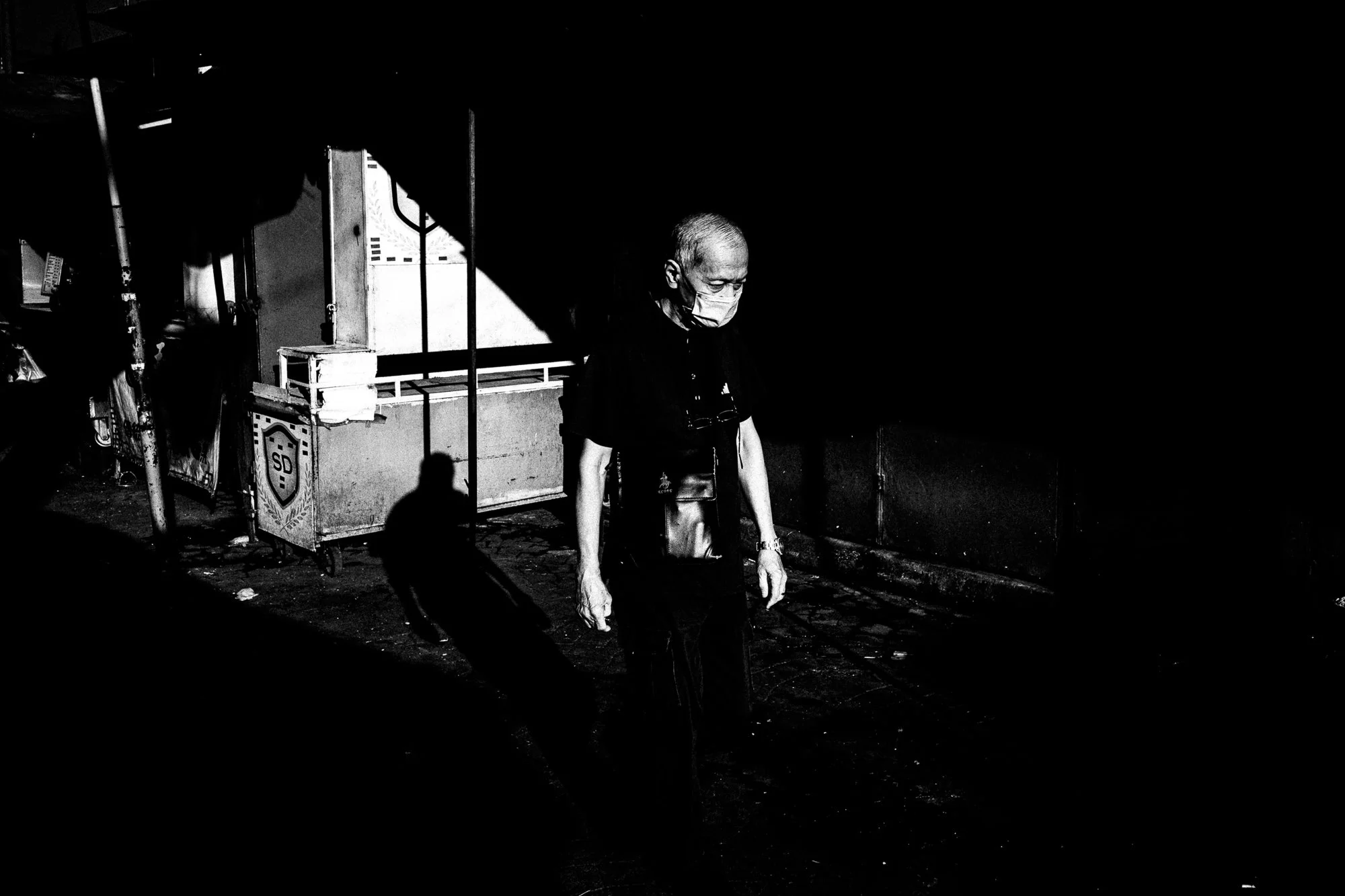
There's a frame from earlier in the year… an old man in a face mask, walking past a market cart, one wedge of hard light catching his face and part of the cart while everything else - the street, the buildings, half his body - disappears into total black. His own shadow doubles him against the cart. Even his shadow, caught at an angle, gives an old, worn look and feel. I kept it as the opener for this whole post, because it's the cleanest version of something I only understood after the fact… after I spent six months figuring out what to cut.
Which is a strange thing to admit, given I did this exact post last year, around this time. Same six months, the first half of the year, same call to go black and white, same "here's my recap" framing. Last year it was smooth and matte. This year, going back through the takes, I noticed I wasn't chasing a look so much as running a series of small experiments in subtraction “how much of a scene can you take away and still have it read as a scene?”. Different frame each time, same underlying question. I've apparently been running a research project without telling myself. Only in looking back at the past six months did I discover this line of thought, through the photos I have been taking.
Before any of the other cuts, there's the obvious one: no colour anywhere in this post. Every single frame. Just harsh black and white this time. Some may prefer this “look”; some may not.
You don't really notice what colour was doing for you until it's gone. A red plastic stool and a blue one turn into the exact same monotone rectangle. That stain on the pavement could be sauce, could be oil, could be something I'd rather not think about at 8am before my roti canai… is now just a dark patch. No way to tell. Ripe or not ripe. Fresh or three days old. Colour was quietly doing a lot of the explaining for me, and I've now sacked it from every photo in this batch, no notice, no severance.
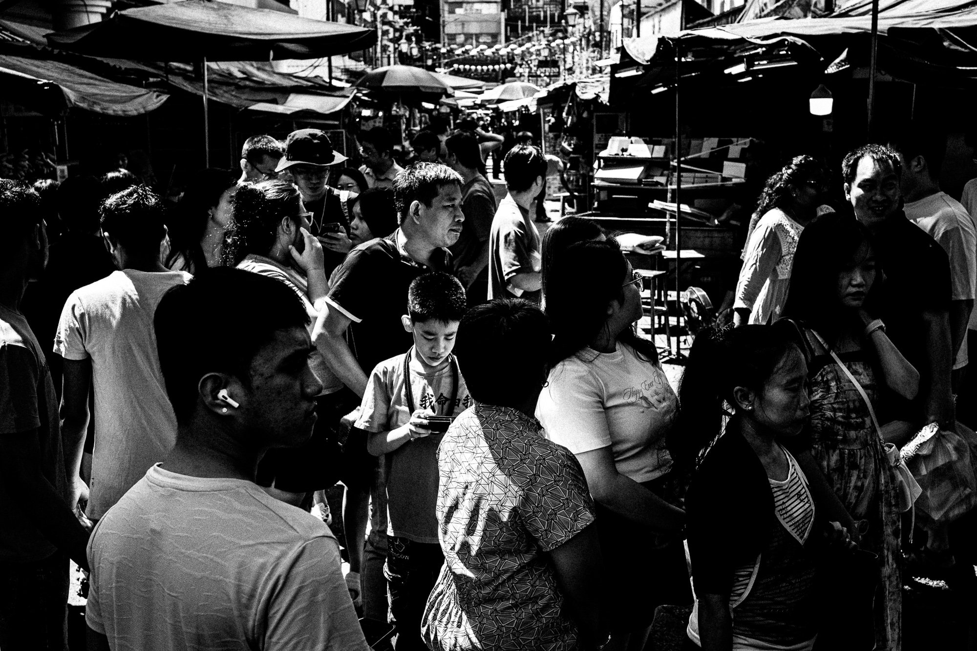
I'm not going to pretend this makes the photos more "honest" or "real"… that's the kind of line photographers say to sound deep, and I don't buy it when other people say it either. Kuala Lumpur doesn't look more true in grey. It just looks like less of it. What you keep is shape and gesture. A person standing somewhere, doing something. What you lose is basically all the useful details. Somewhere in that trade-off is the whole reason I keep doing this to myself every year.
Cutting the light
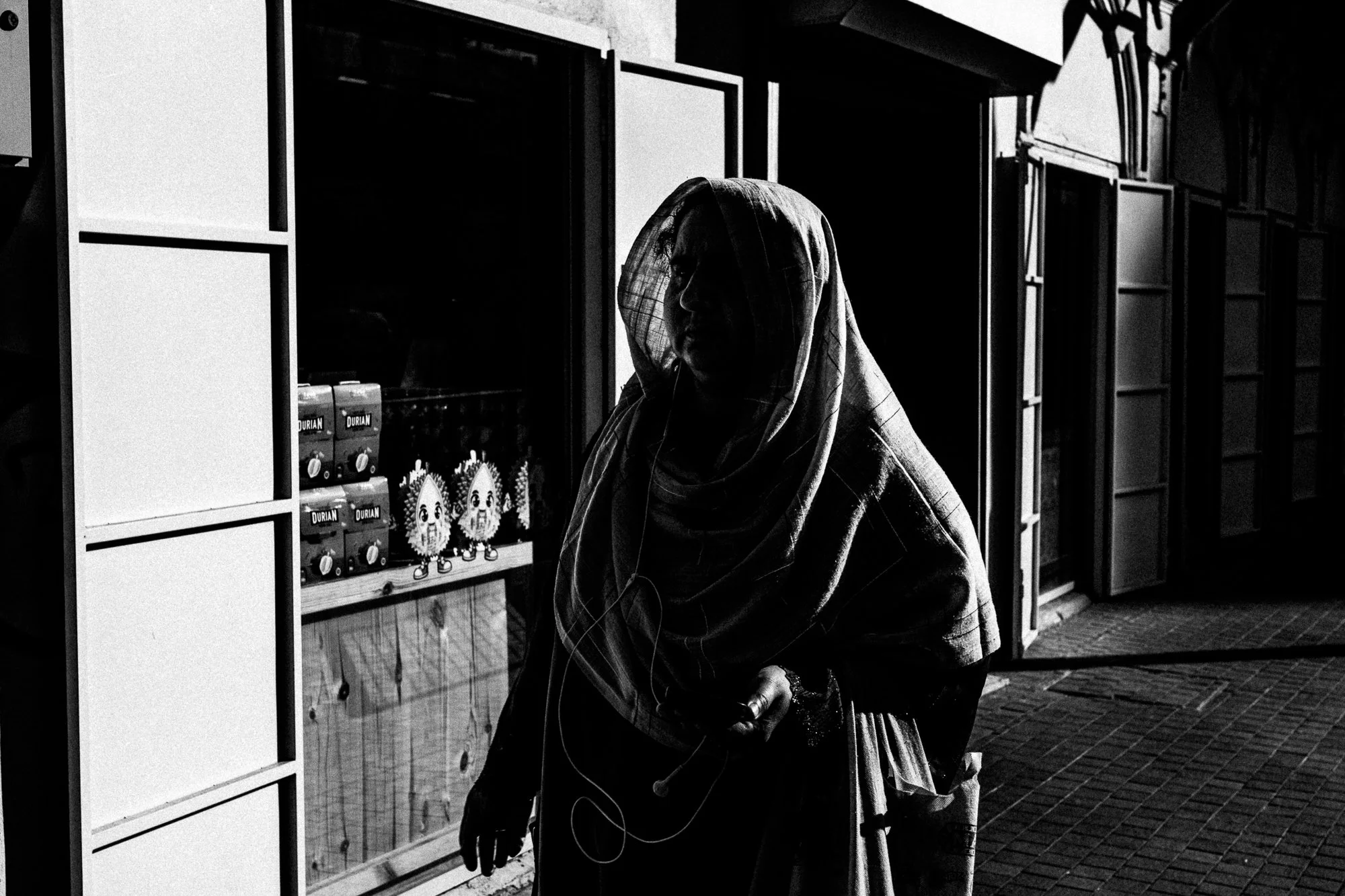
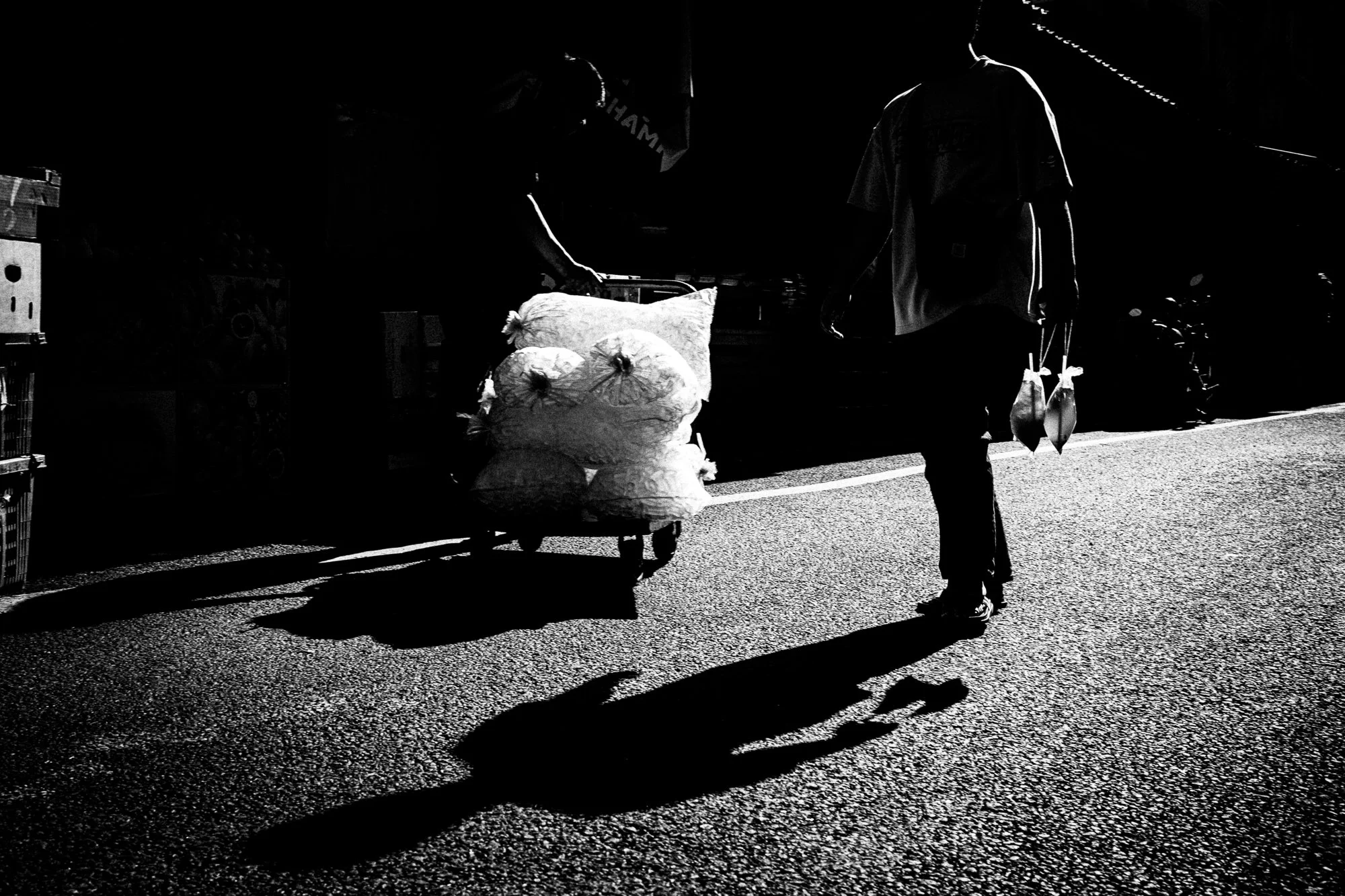
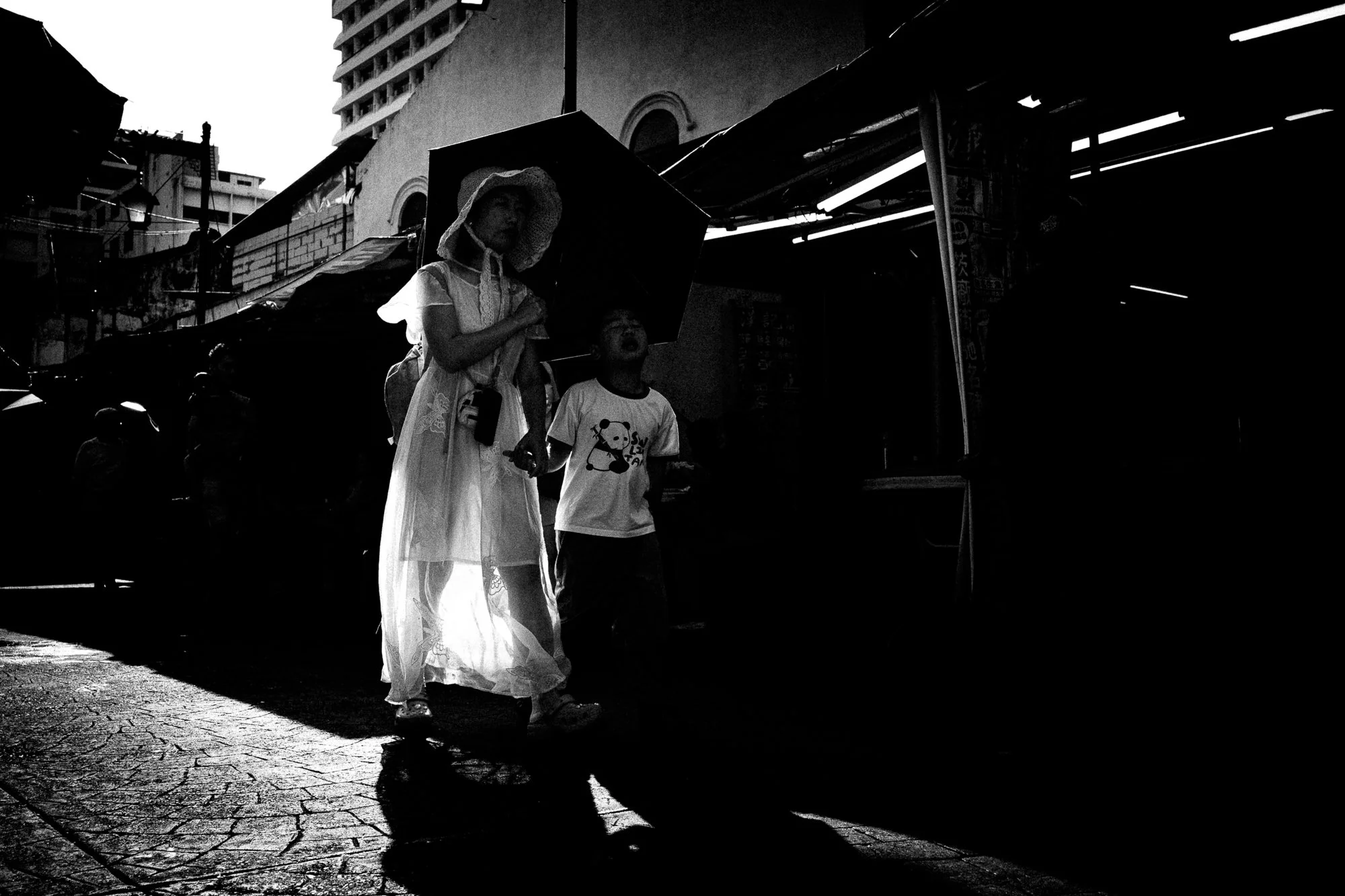
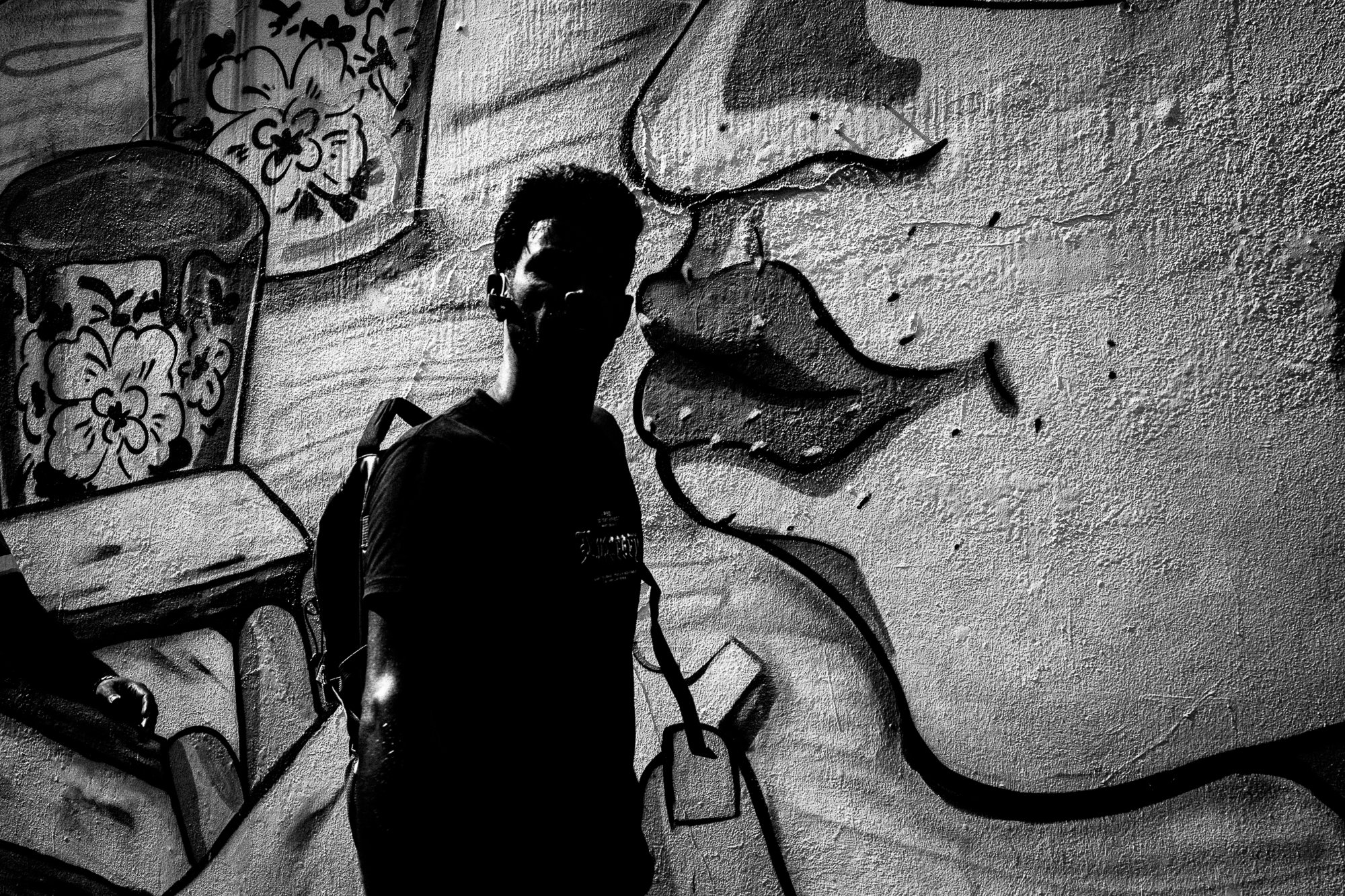
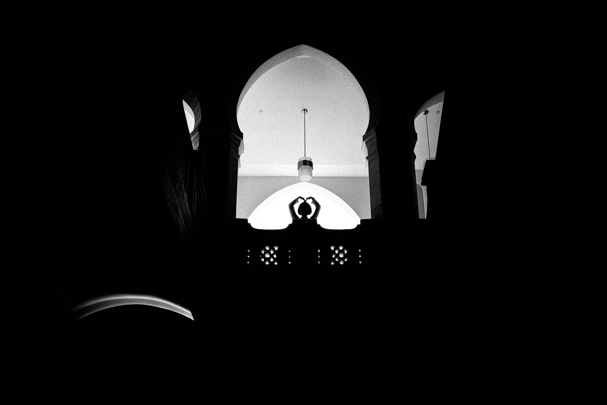
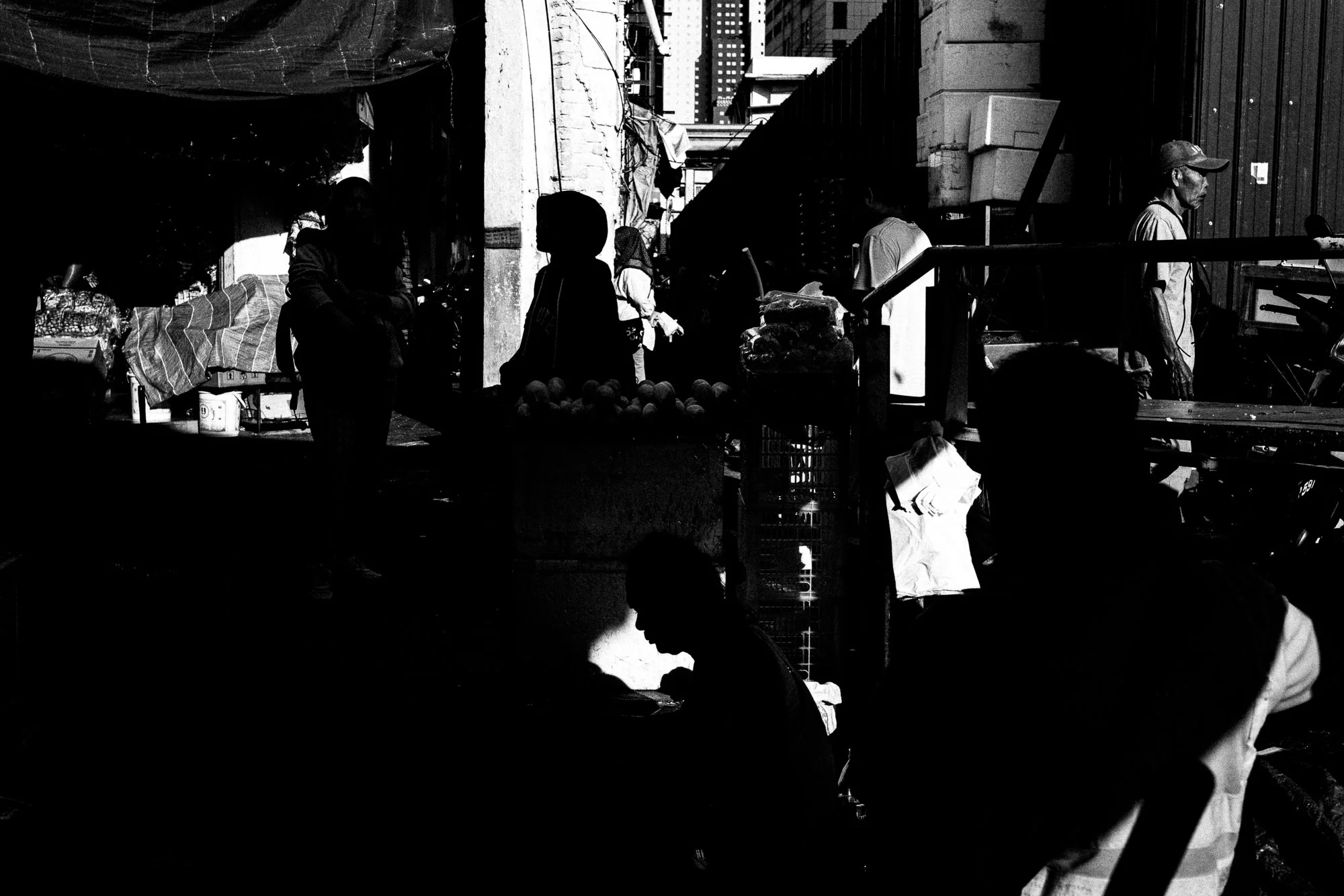
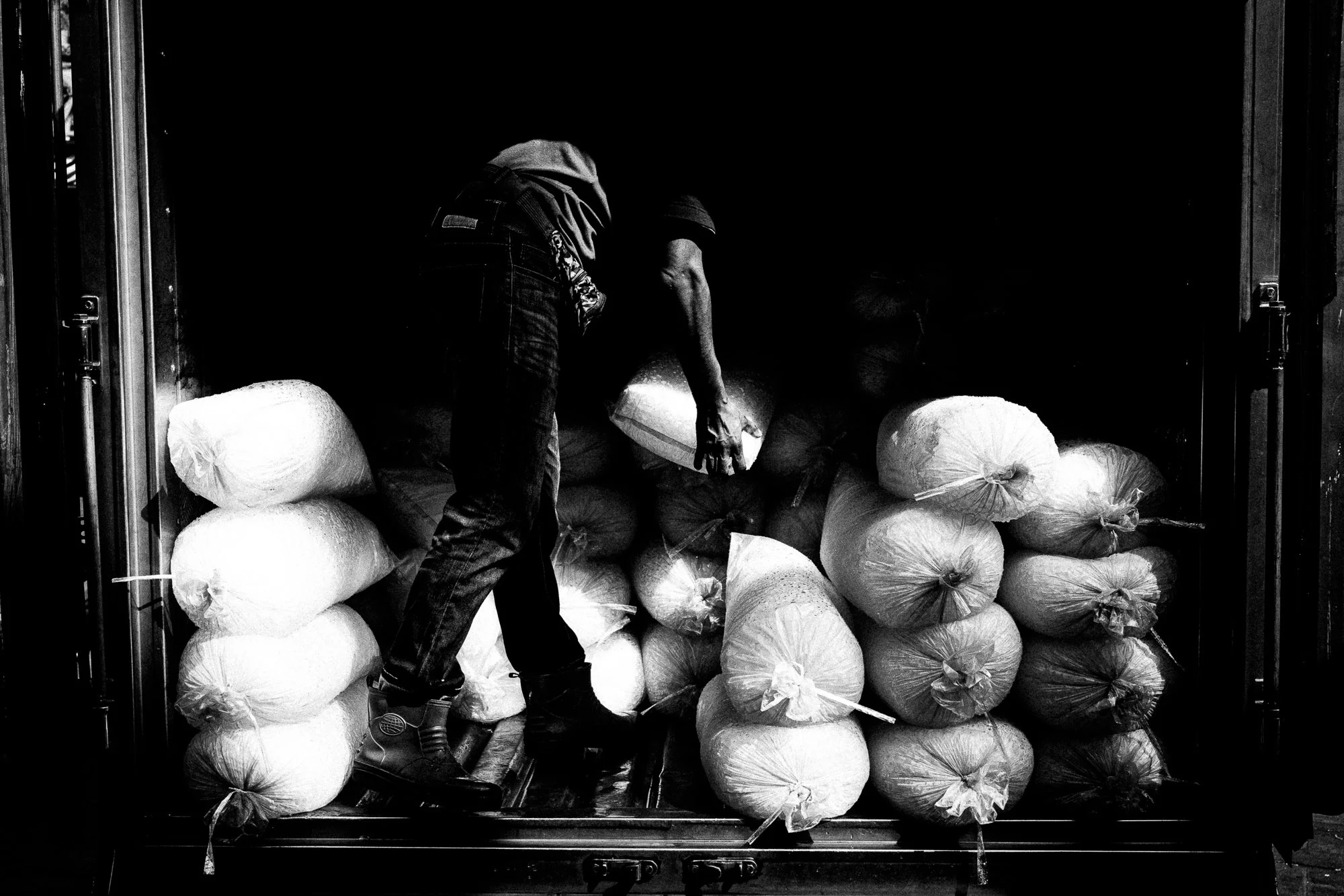
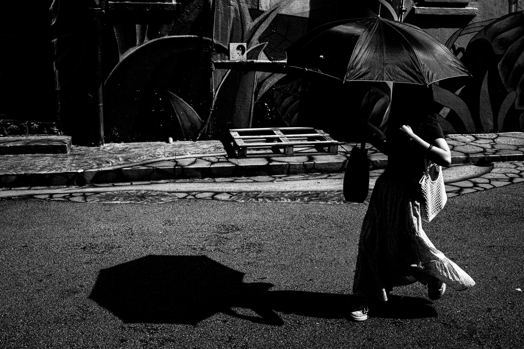
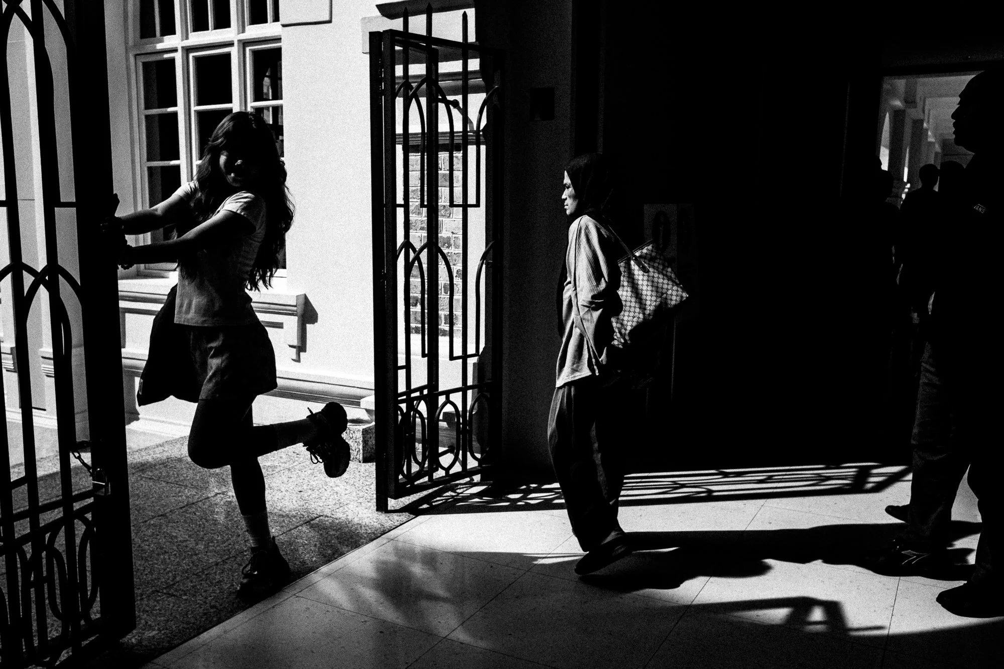
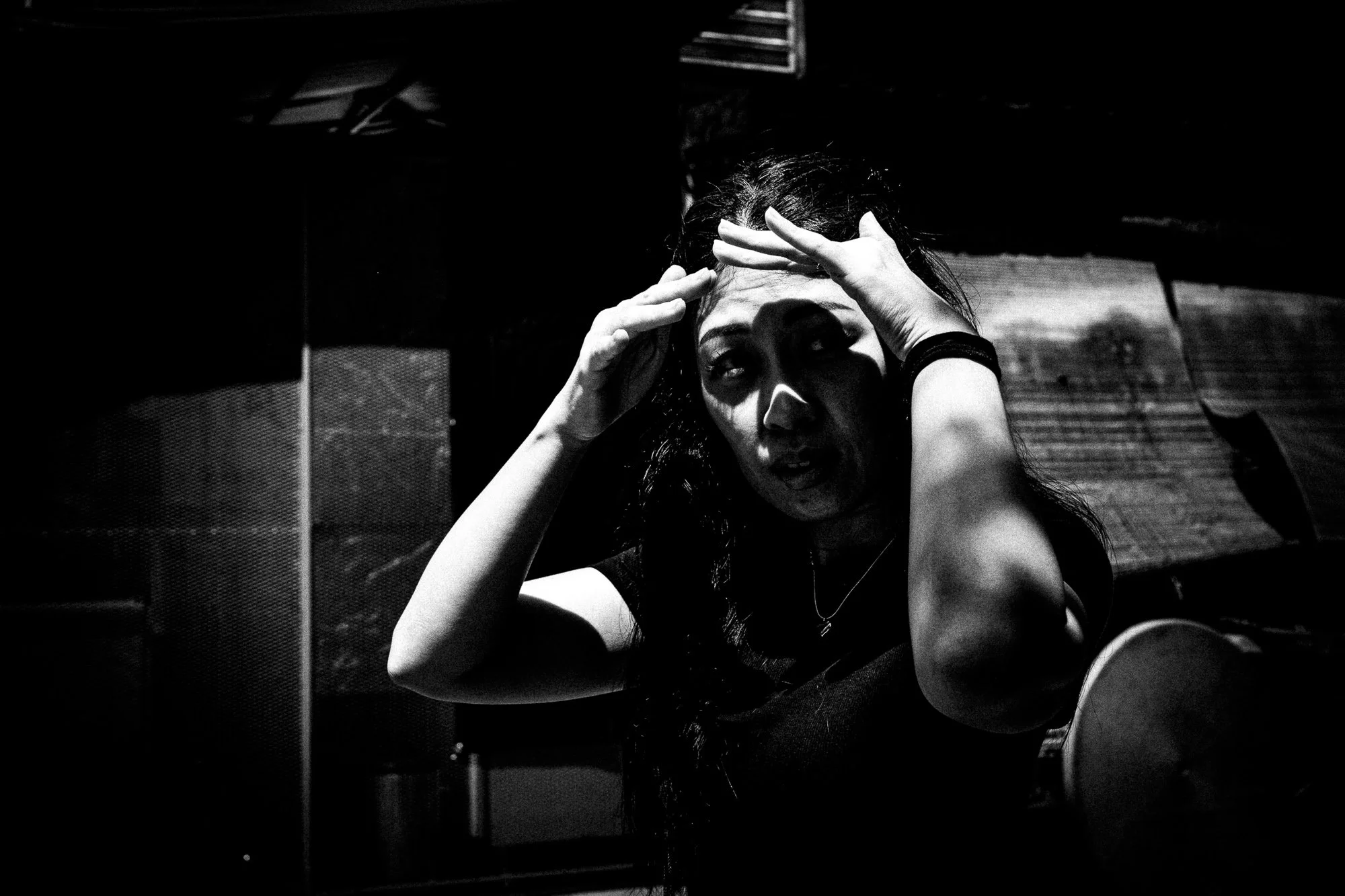
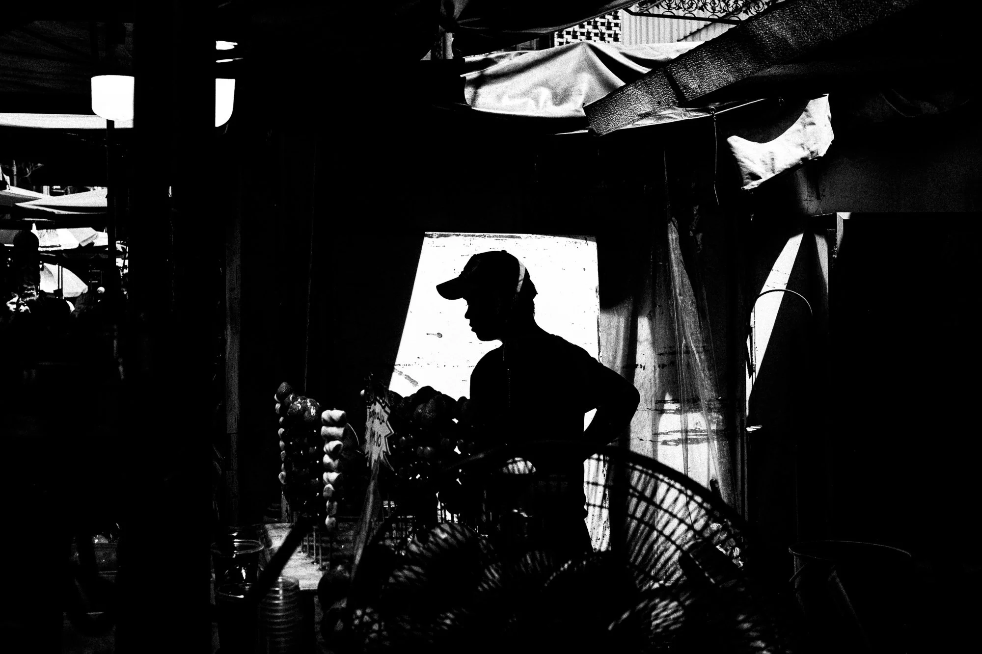
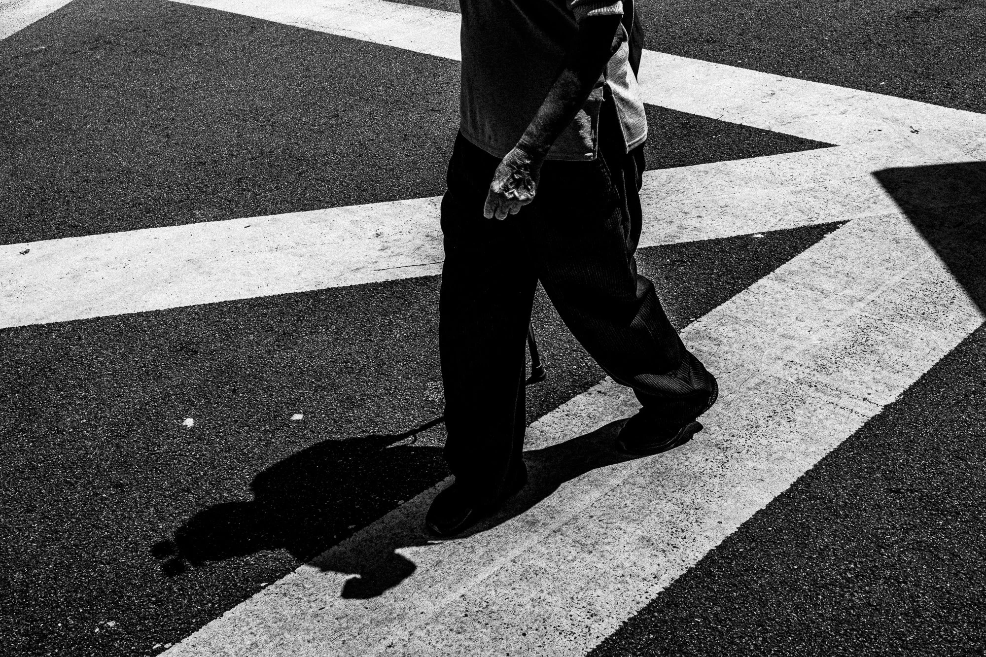
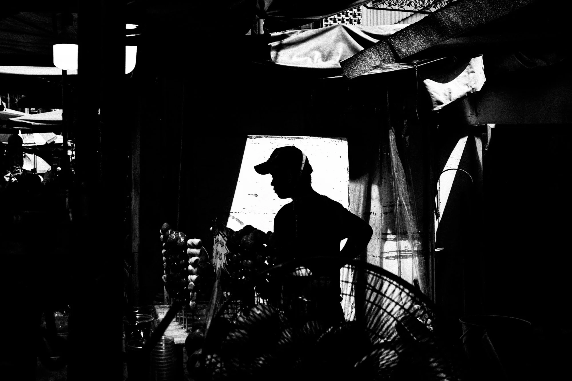
The most obvious version of this is silhouette, and there's a lot of it in this batch. A hawker reduced to a hat and a set of shoulders against a lit doorway. You can kind of make out the other objects, identify a place, but it's purposefully made to be vague… void of those other details. A figure crossing a crosswalk as a pure black shape against white paint. Details thrown out entirely, i.e. no face, no fabric, no texture. What's left is posture and outline, which turns out to be enough. More than enough, some days.
Cutting the stillness
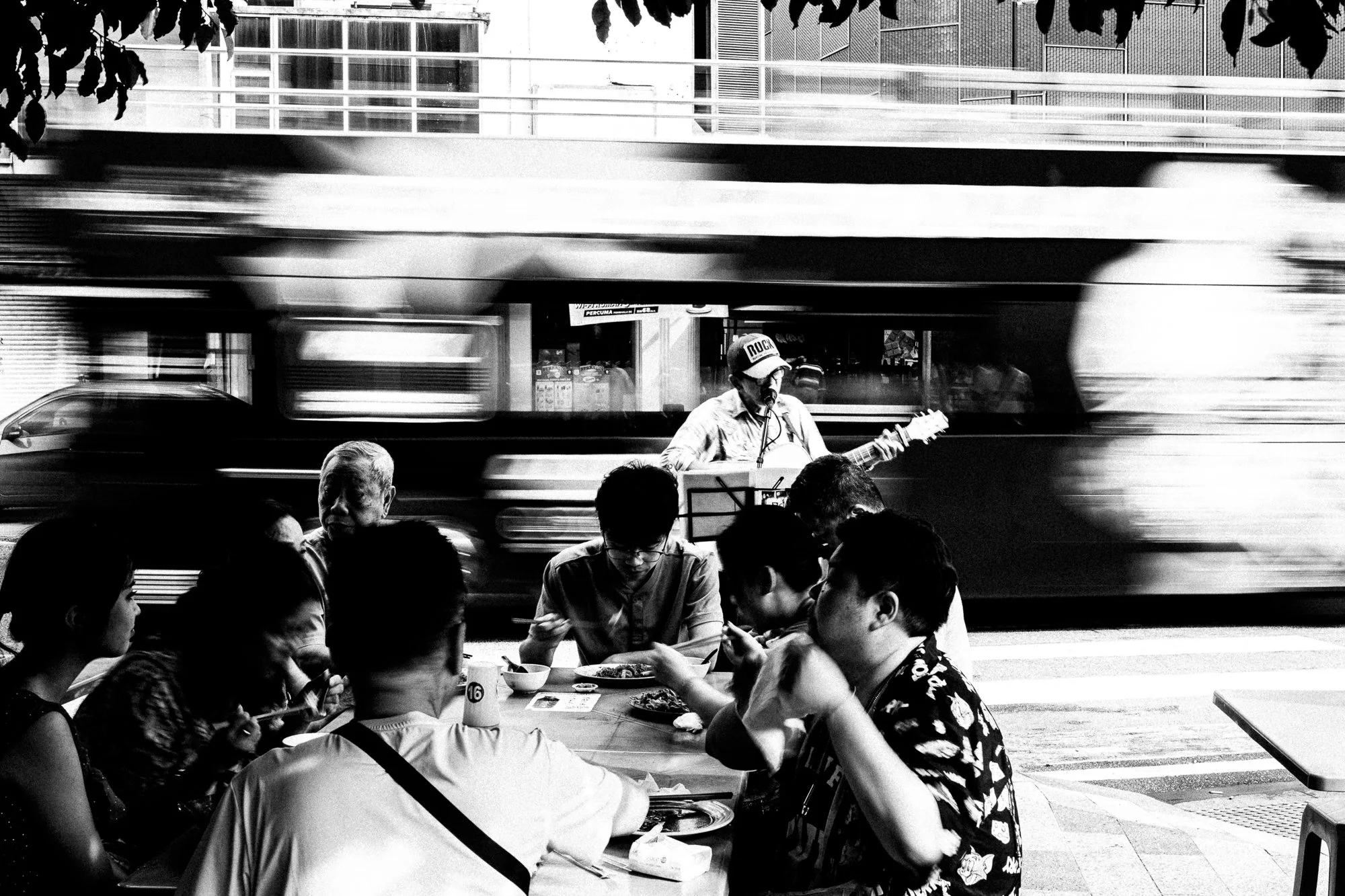
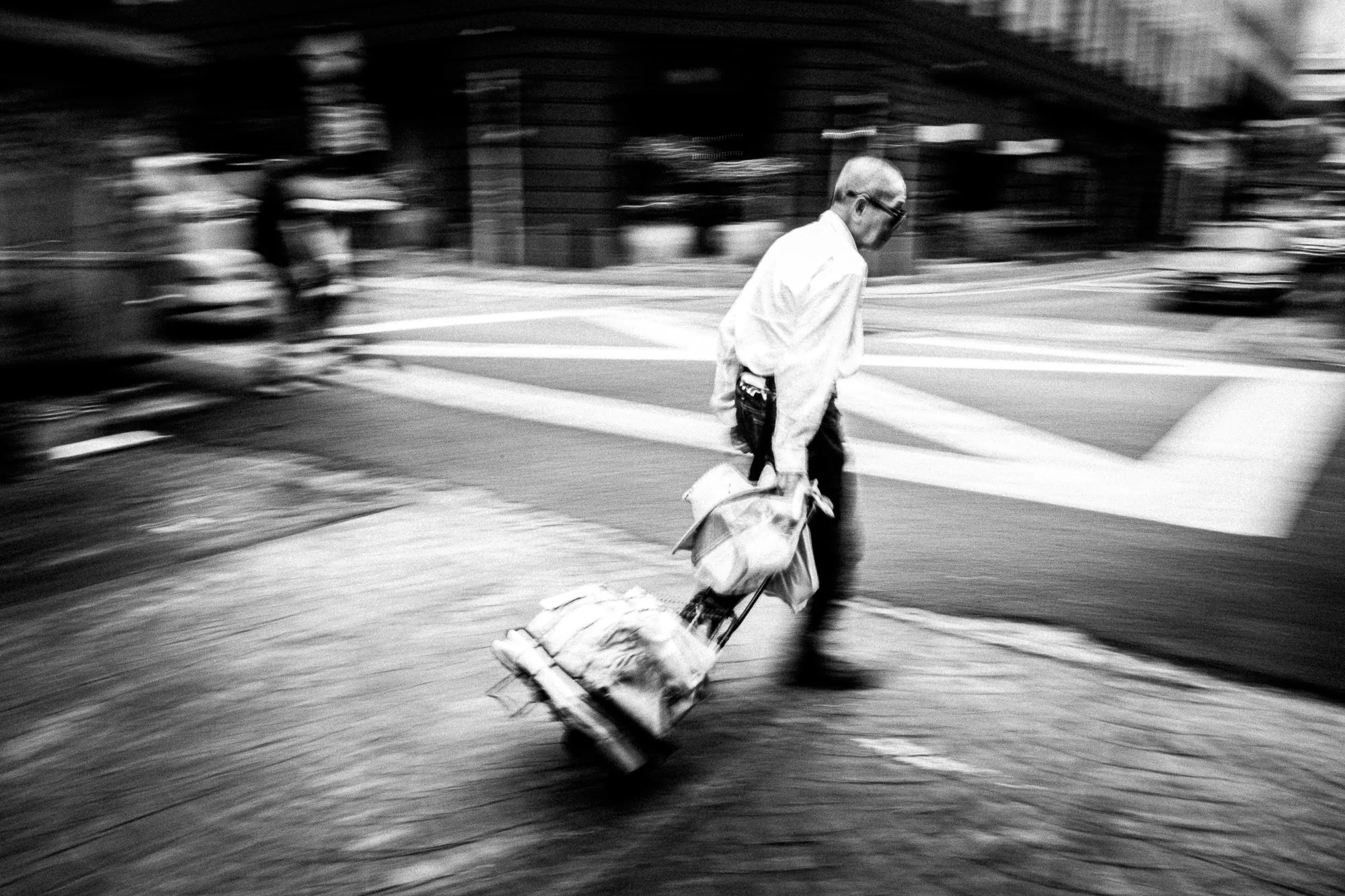
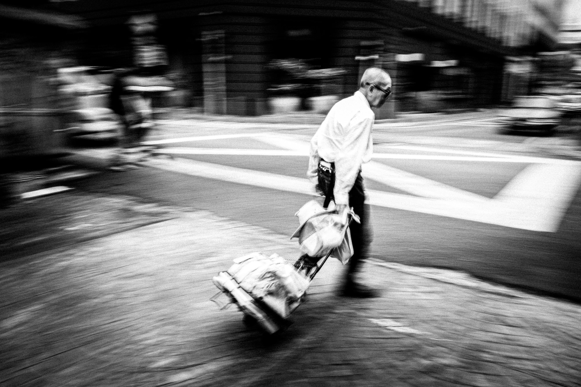
The second cut is time itself. A man hauling a cart, panned into a smear of motion against a sharp background. A bus tearing through a frame at a kopitiam table, blurred into a streak of light and steel while a guitarist and a table of diners hold perfectly still around it. Here the trade isn't light for dark; it's stillness for movement. You lose the exact shape of a thing to keep the fact that it was moving: different subtraction, same instinct.
Cutting the single reading
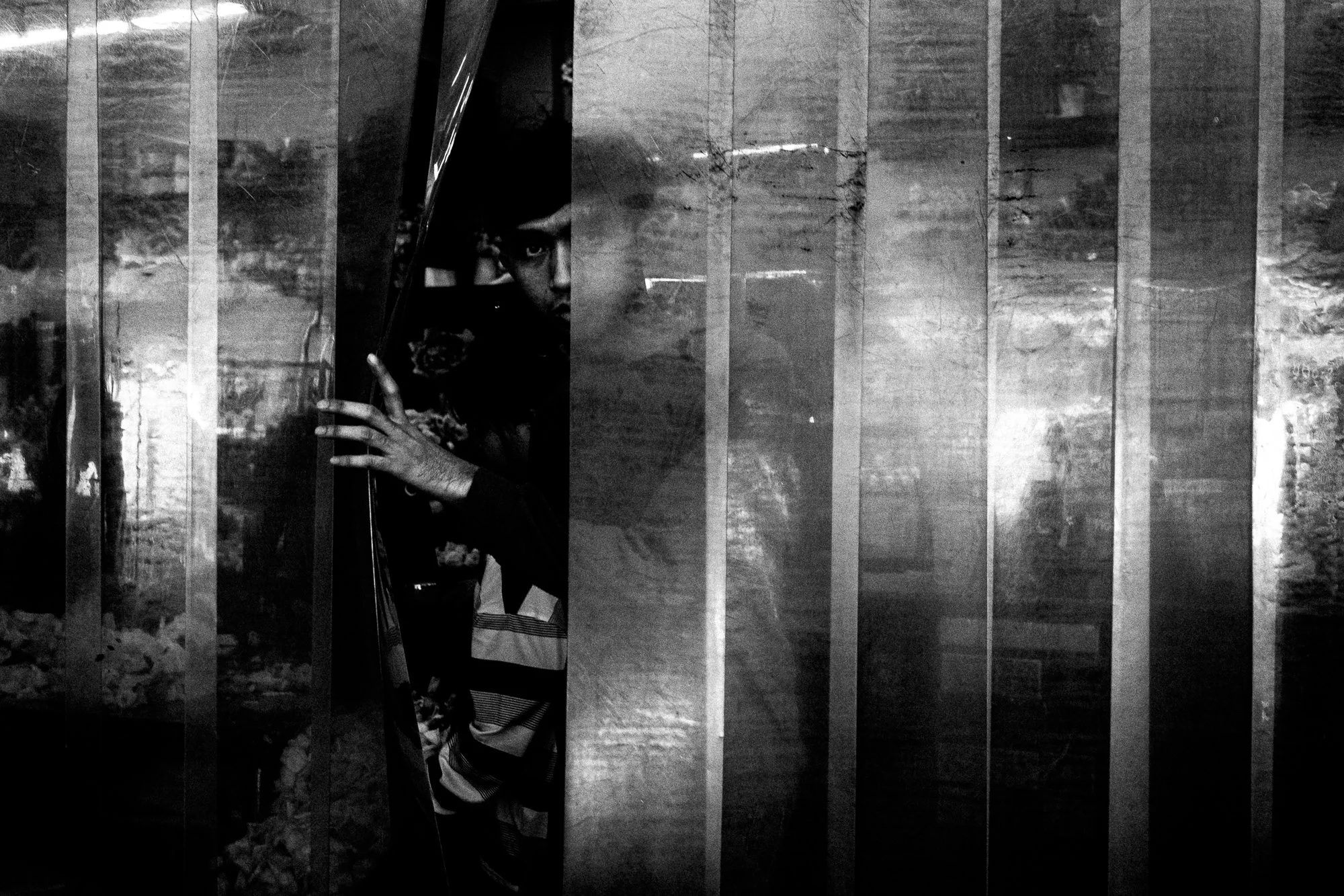
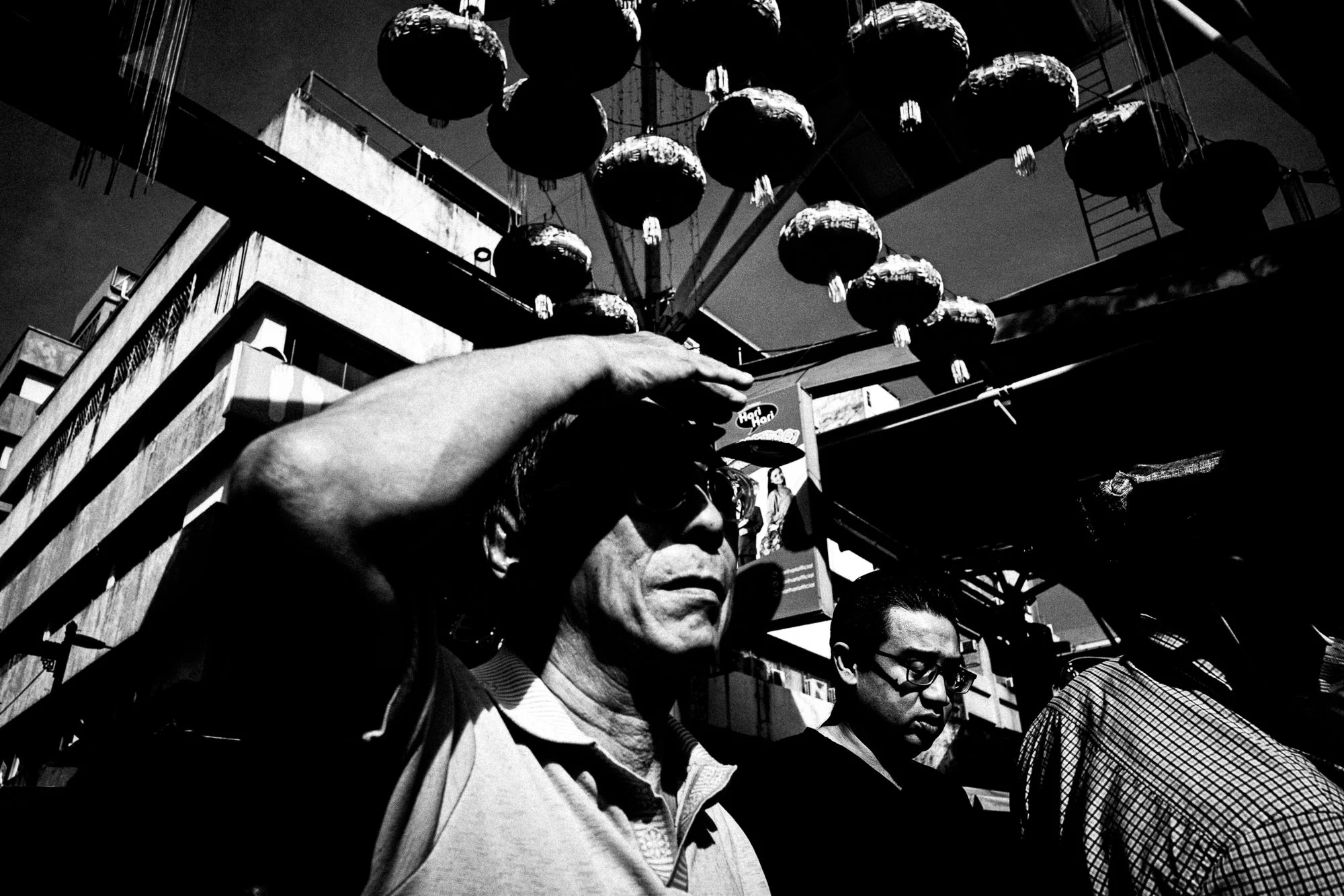
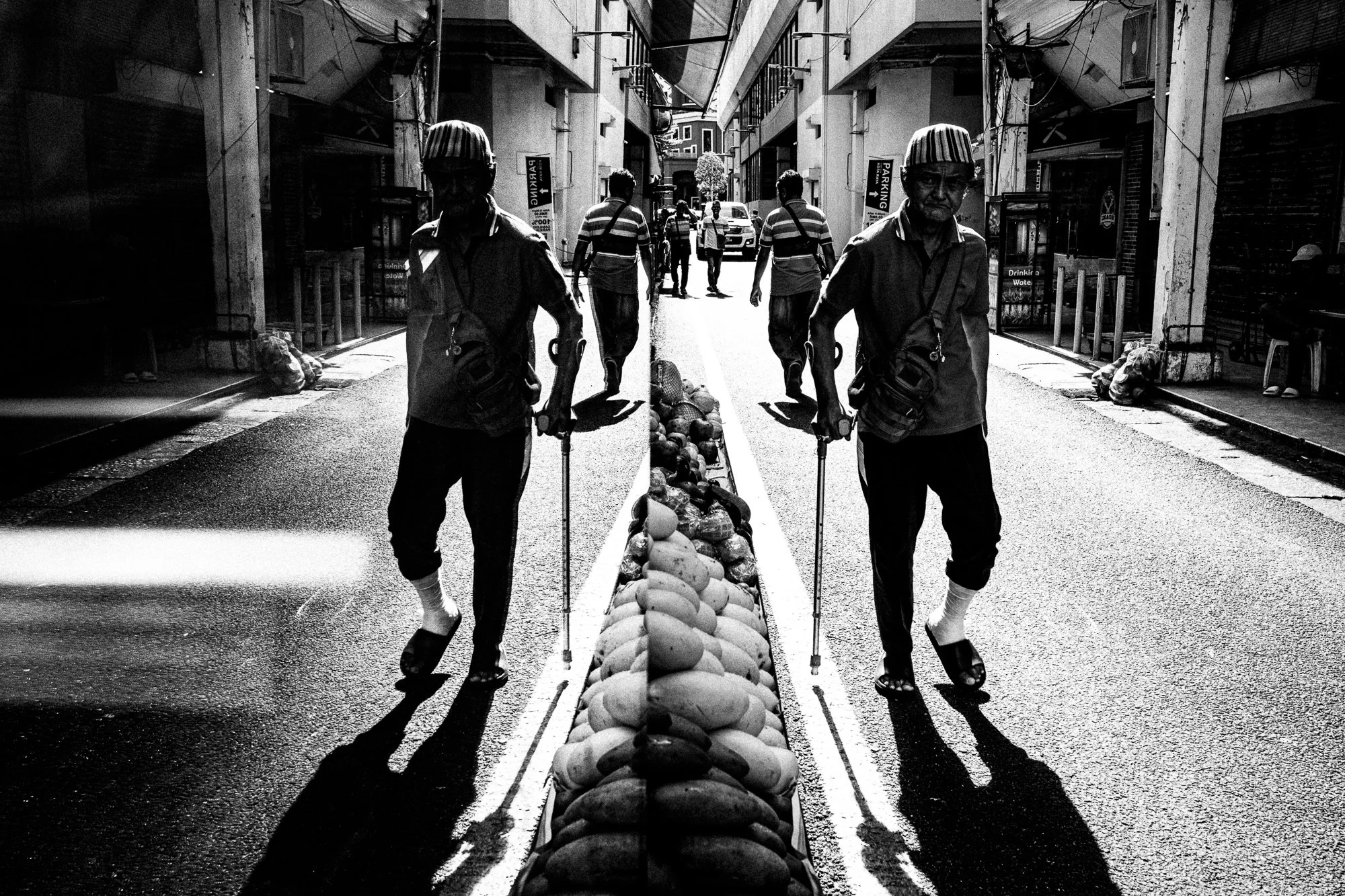
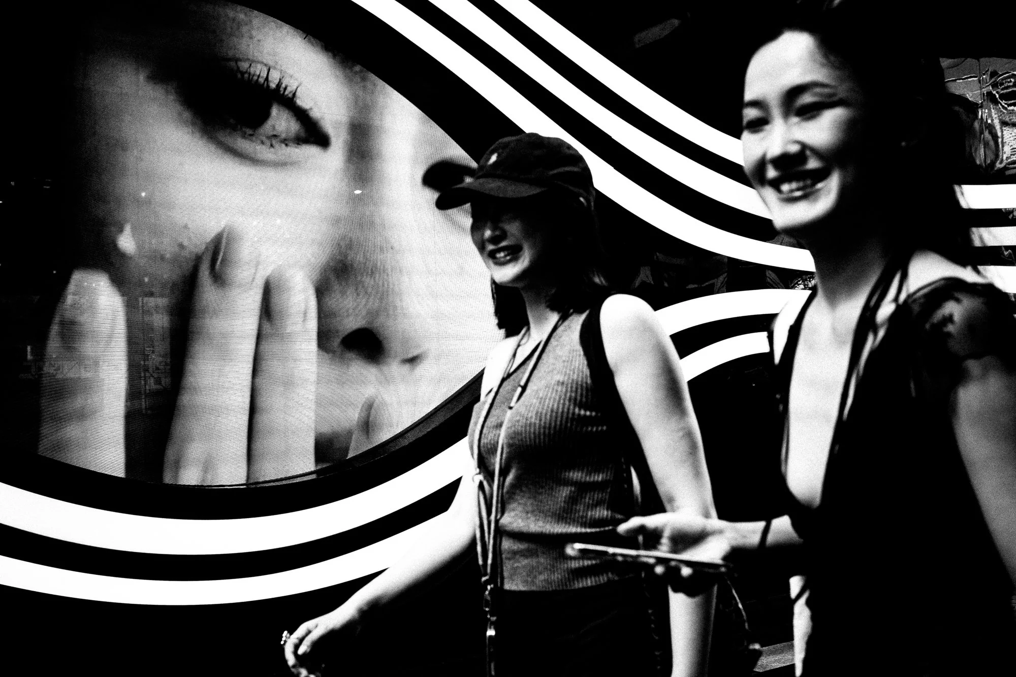
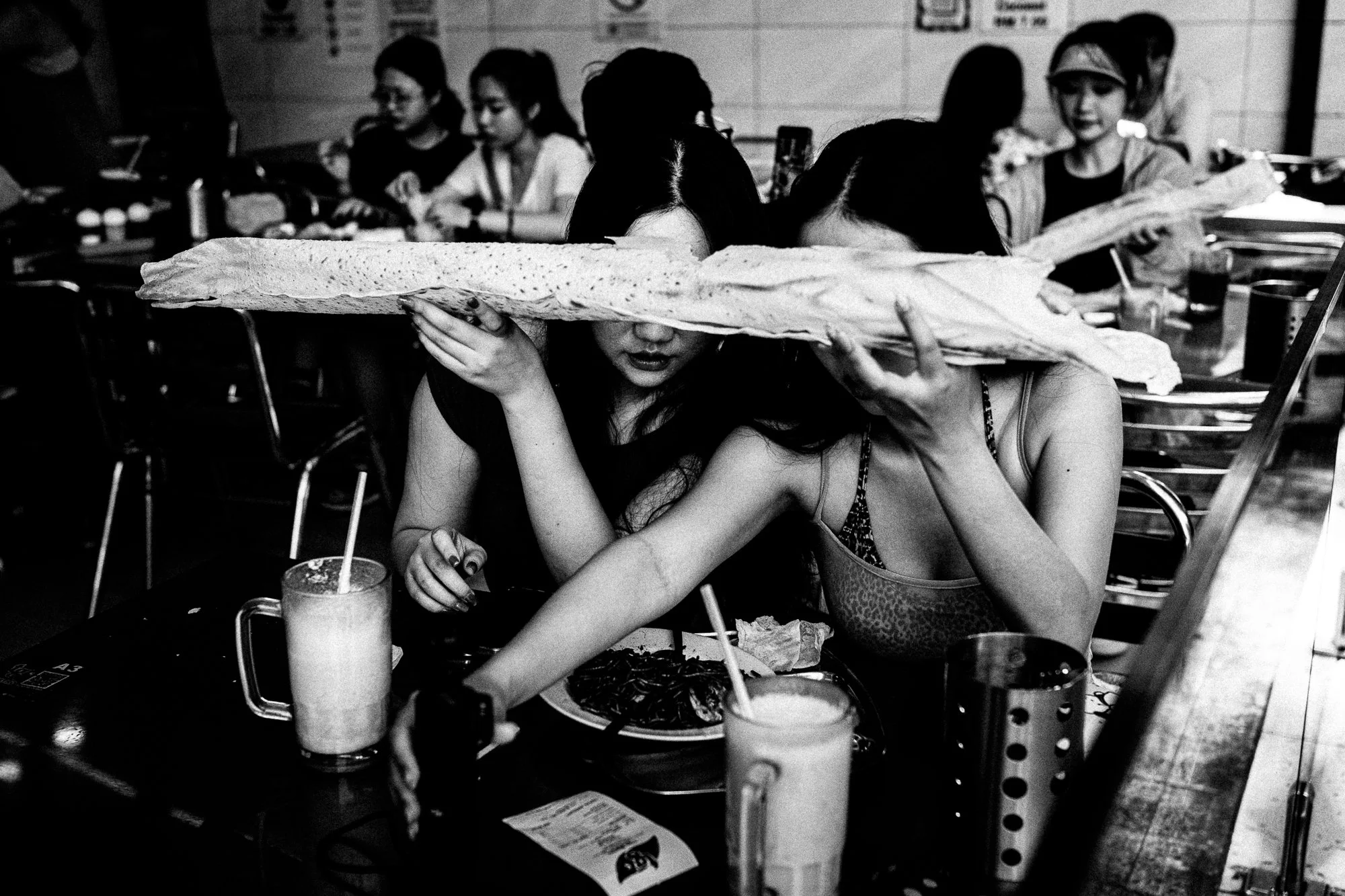
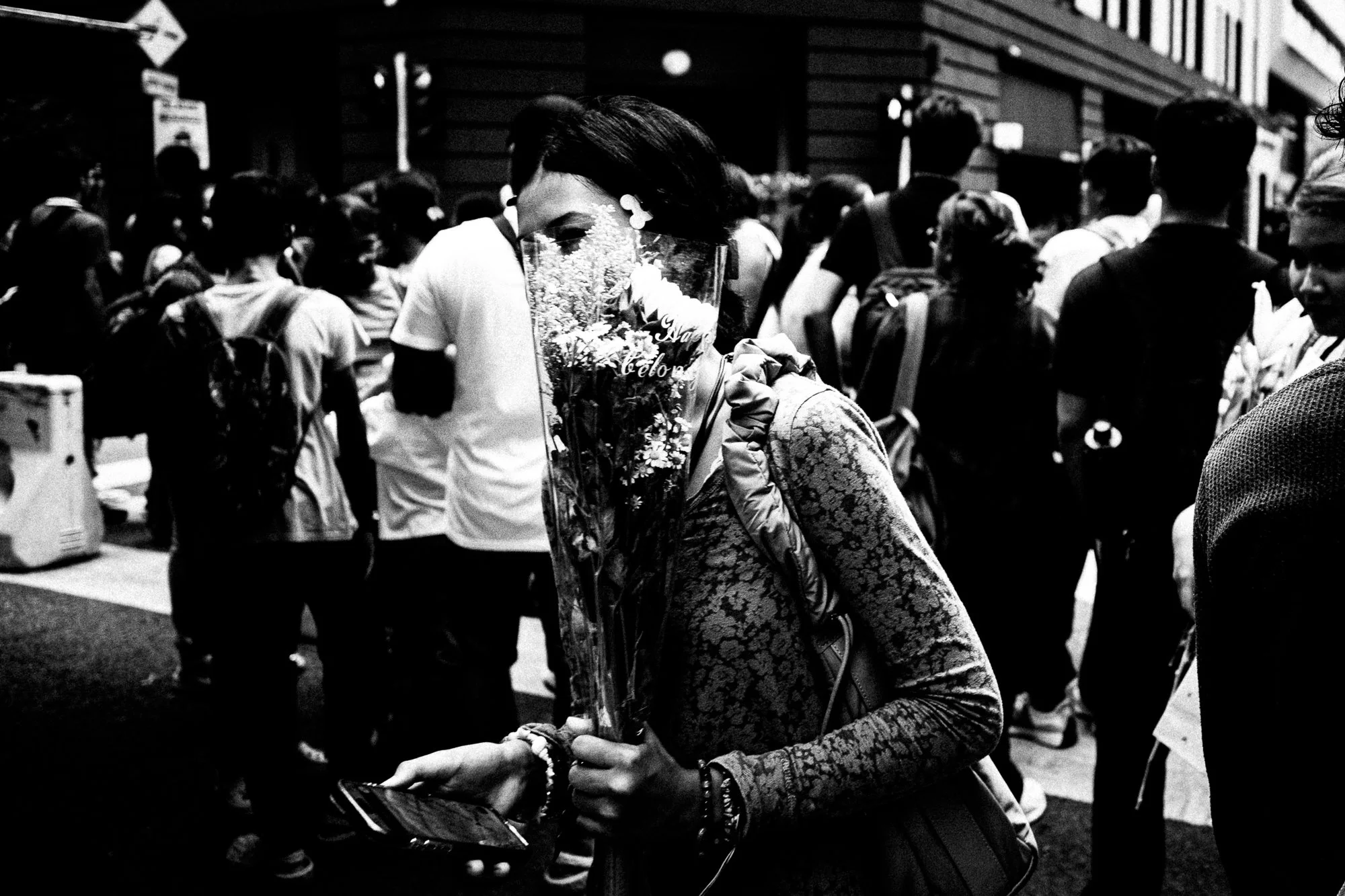
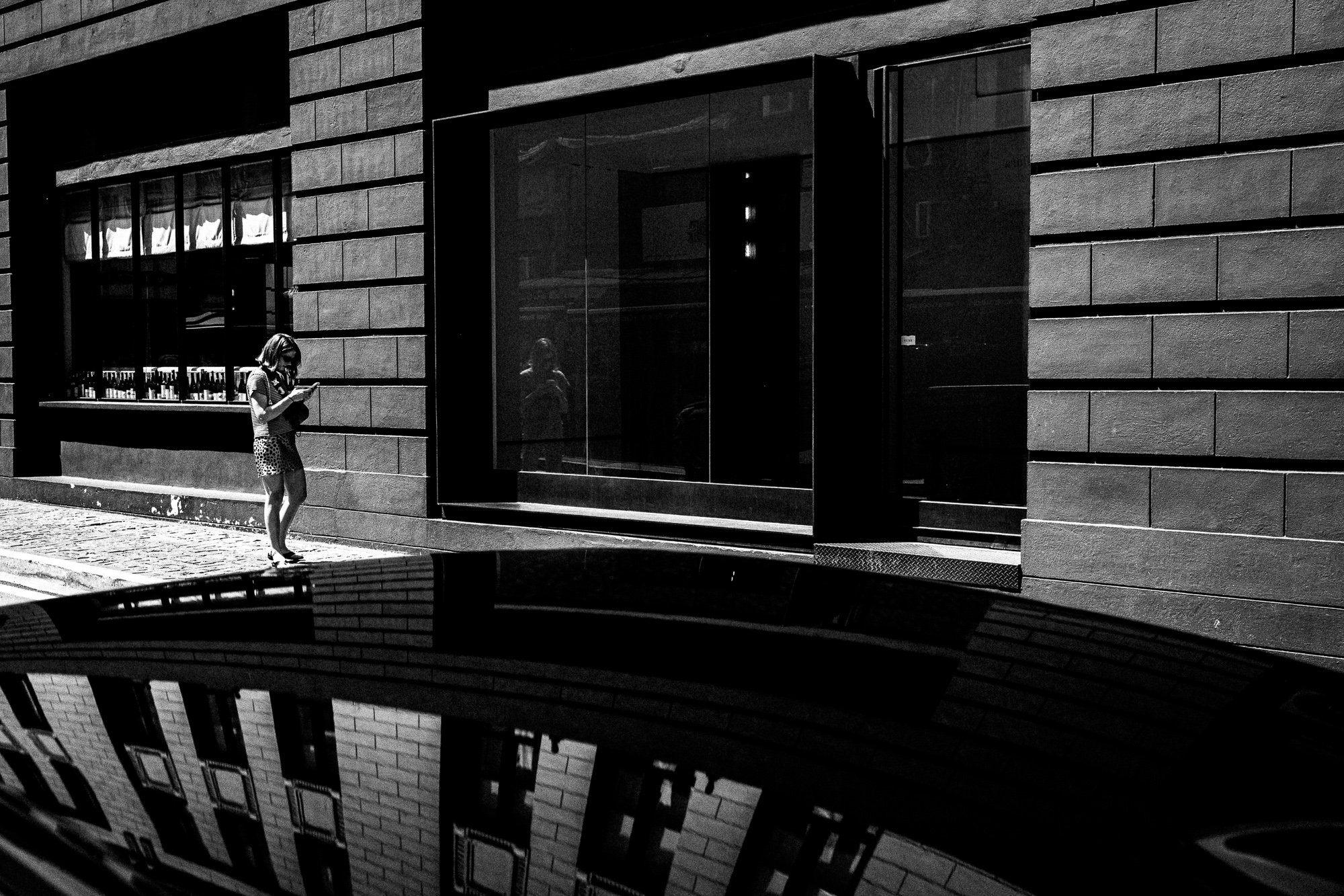
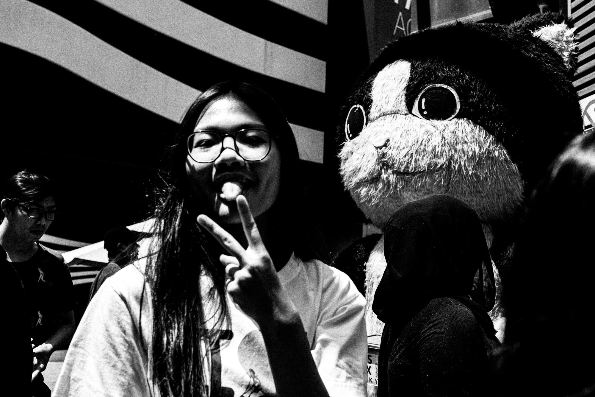
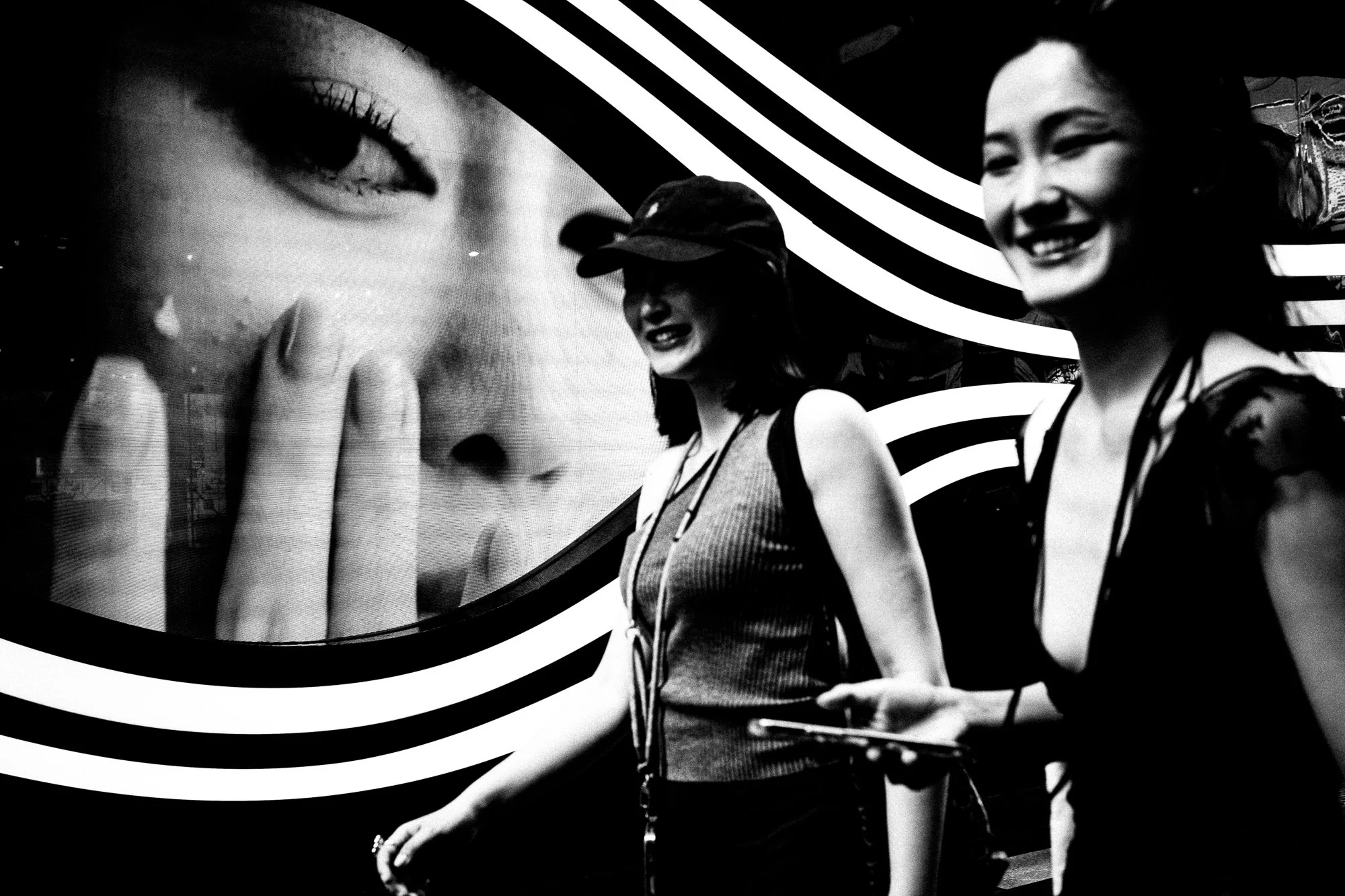
Then there's the stuff I didn't plan at all. A shop billboard face behind two women laughing, so the frame reads as three faces instead of two. Later on you’ll see a singular man on crutches, mirrored into a symmetrical pair and a market stall of mangoes lined up dead-centre. None of these removes detail - if anything, they add it. What they cut is certainty. You can't look at any of these frames and know, immediately, what you're looking at. That took me longer to notice as a pattern than the silhouettes did, because it never felt like a decision in the field. I only saw it scrolling through the takes afterwards. And it turns out that I like taking photos of reflections.
Cutting the subject
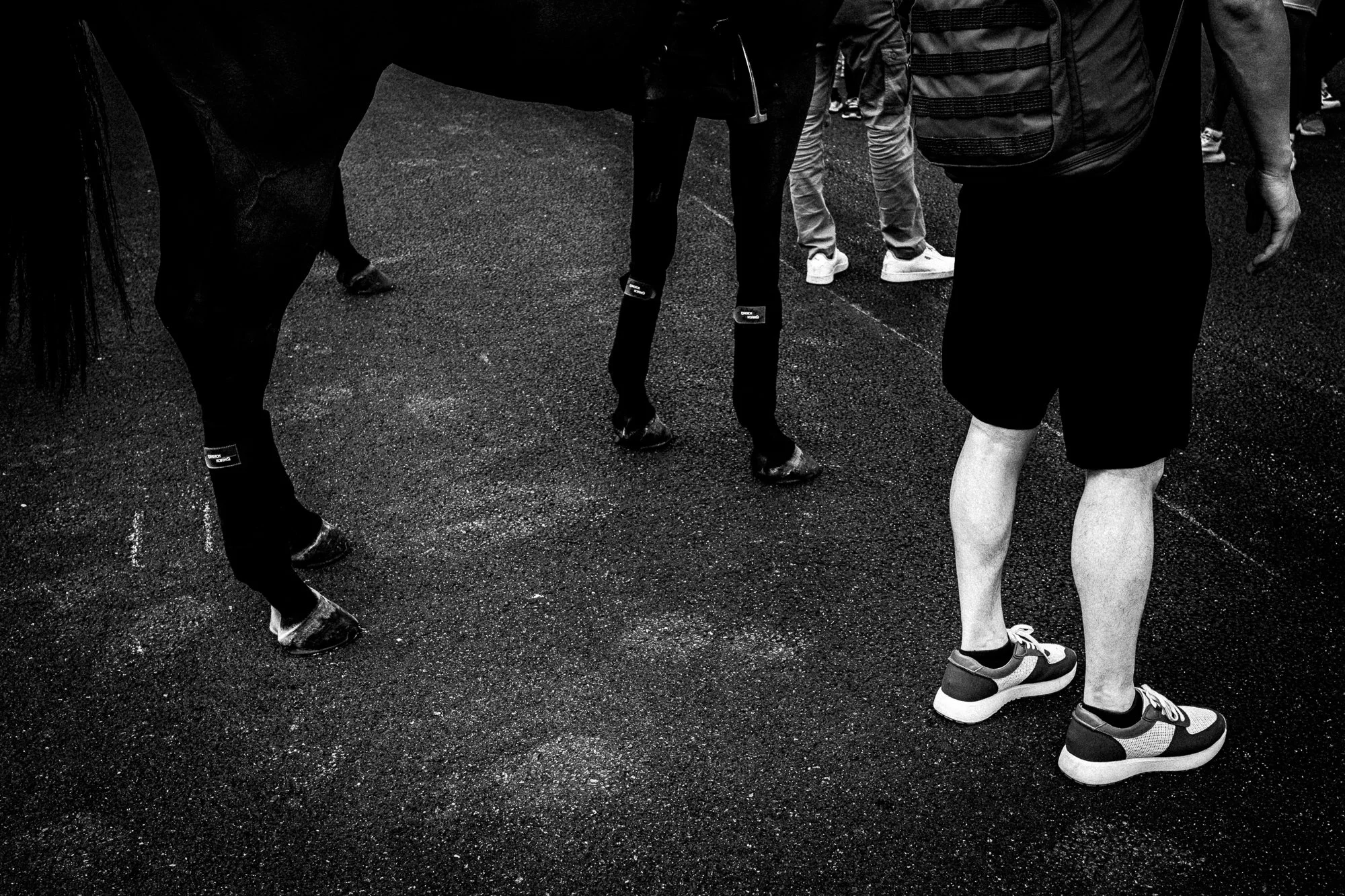
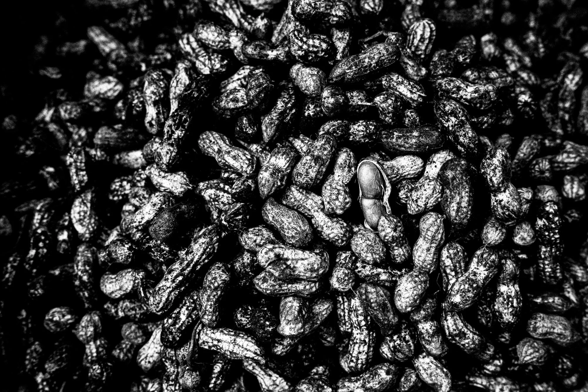
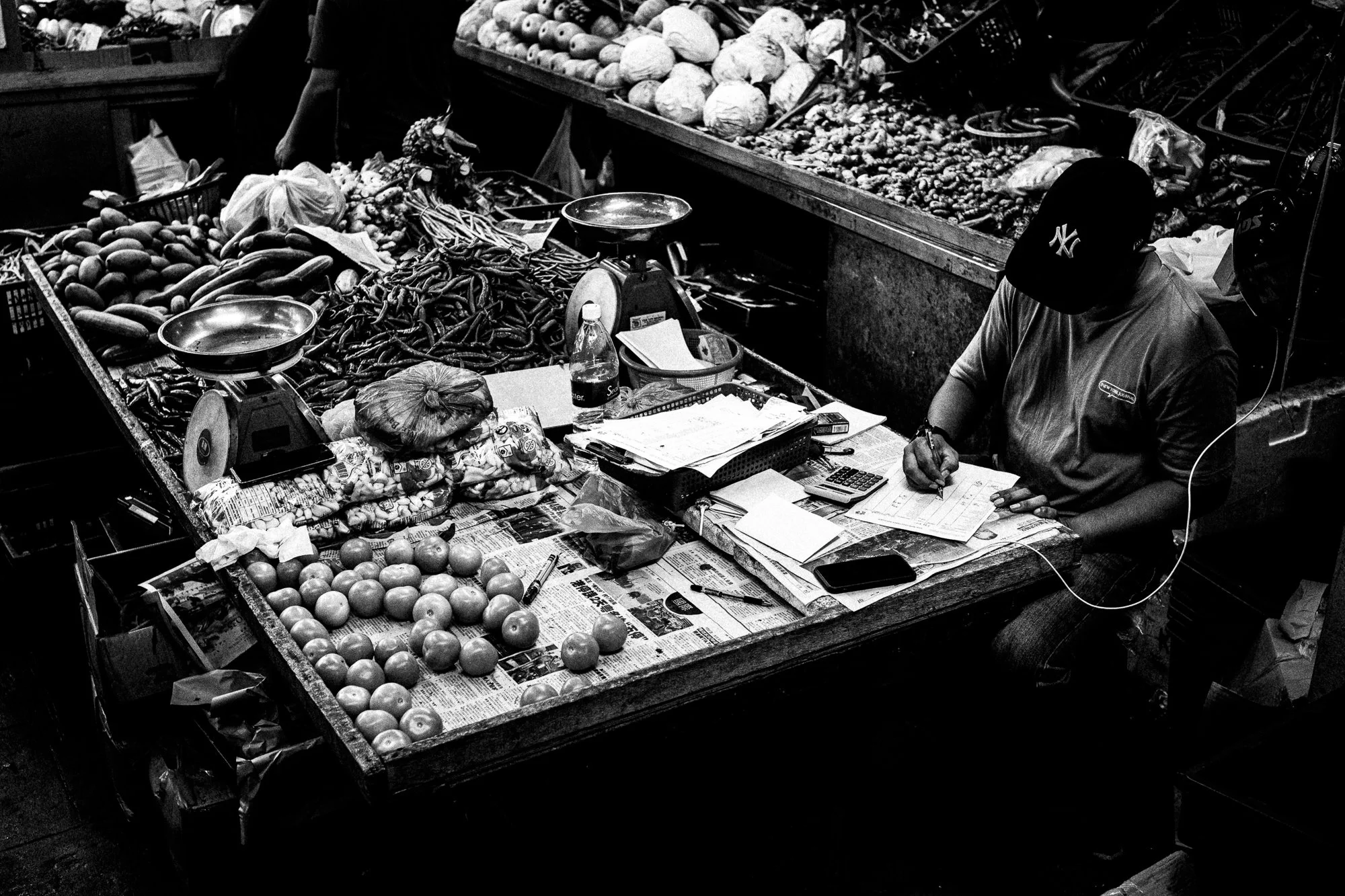
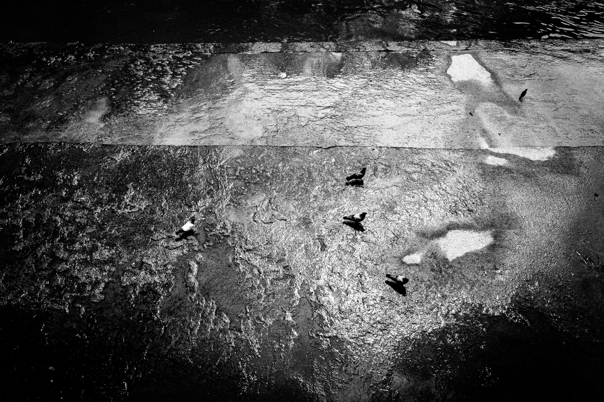
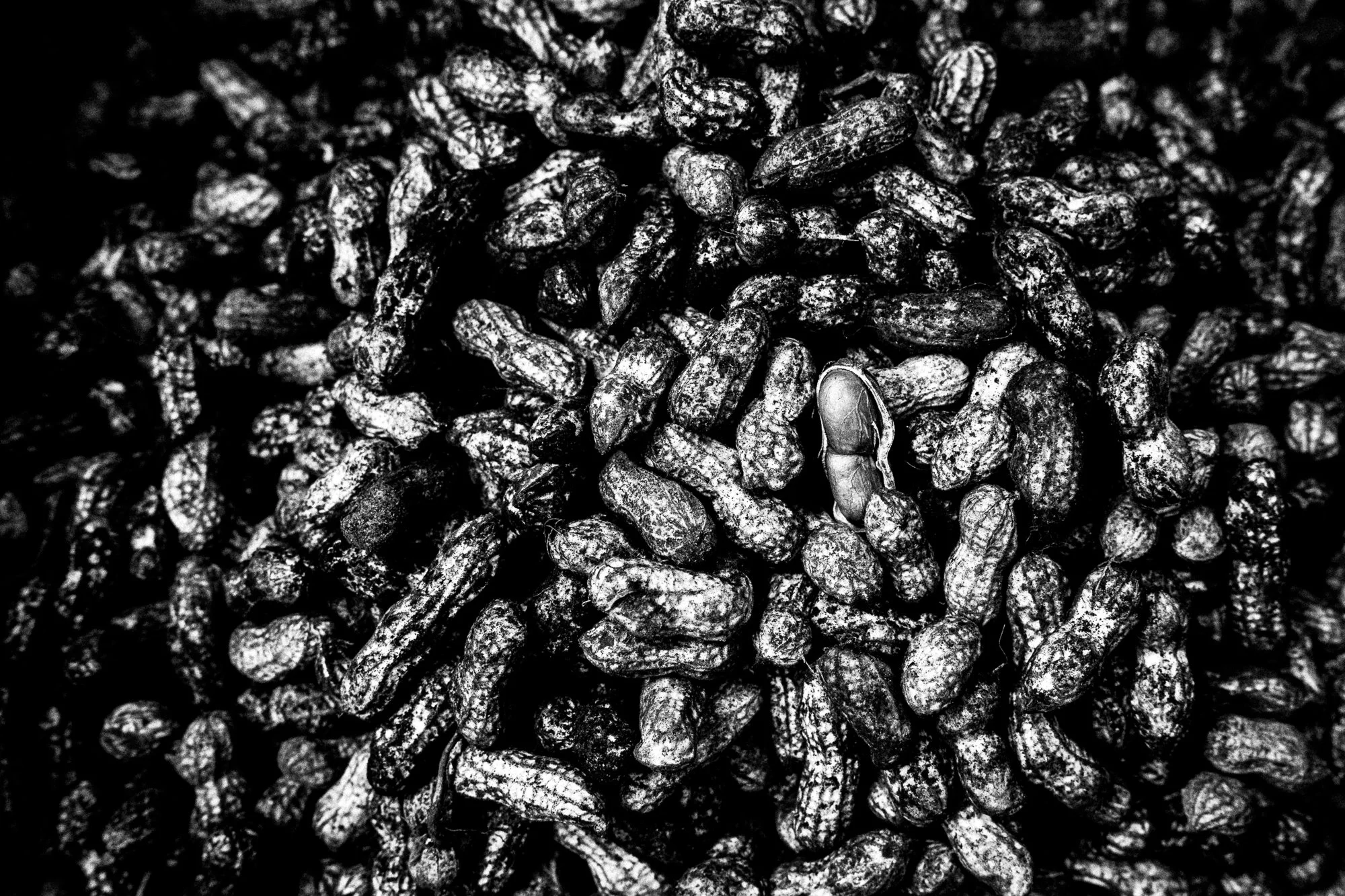
The most extreme version of all this is the frames with no person in them at all; a tangle of peanuts filling the whole frame, a market stall shot from directly overhead, nothing but rhythm and repetition. No story, no gesture, no face to read. Just pattern standing in for content. I don't know if these count as street photography in the way the rest of this post does. I kept them anyway.
The one I didn't cut anything from
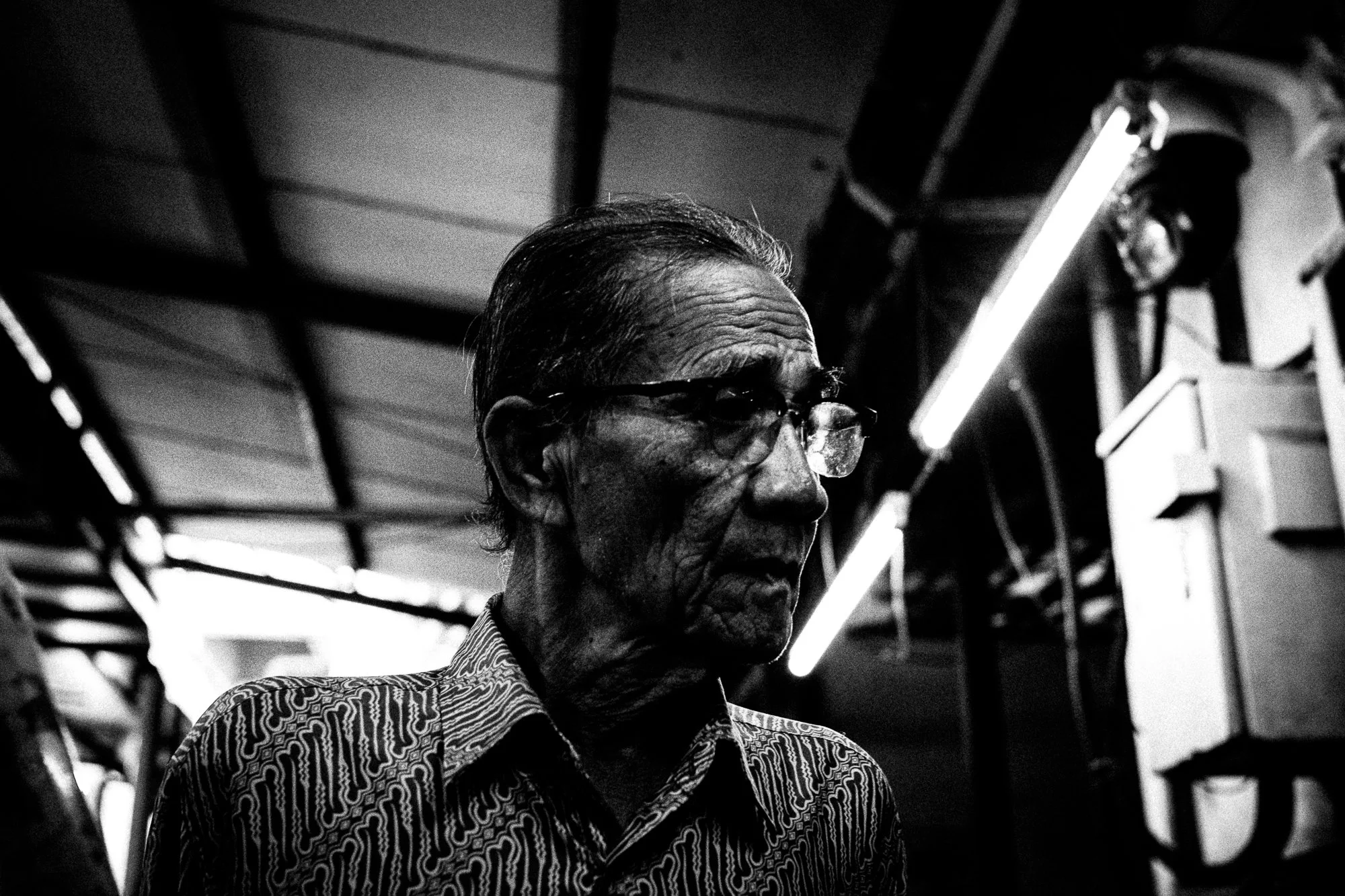
And then, in the middle of all that subtracting, there's a straight portrait of an old man under a strip of fluorescent light, looking away from the lens. Nothing removed. No silhouette, no blur, no trick of reflection. Just a face, lit plainly, looking back. Going through six months of pictures built around leaving things out, this is the one that stops me, because it's the only frame in the whole batch where I didn't cut anything, and it might be the most honest one here.
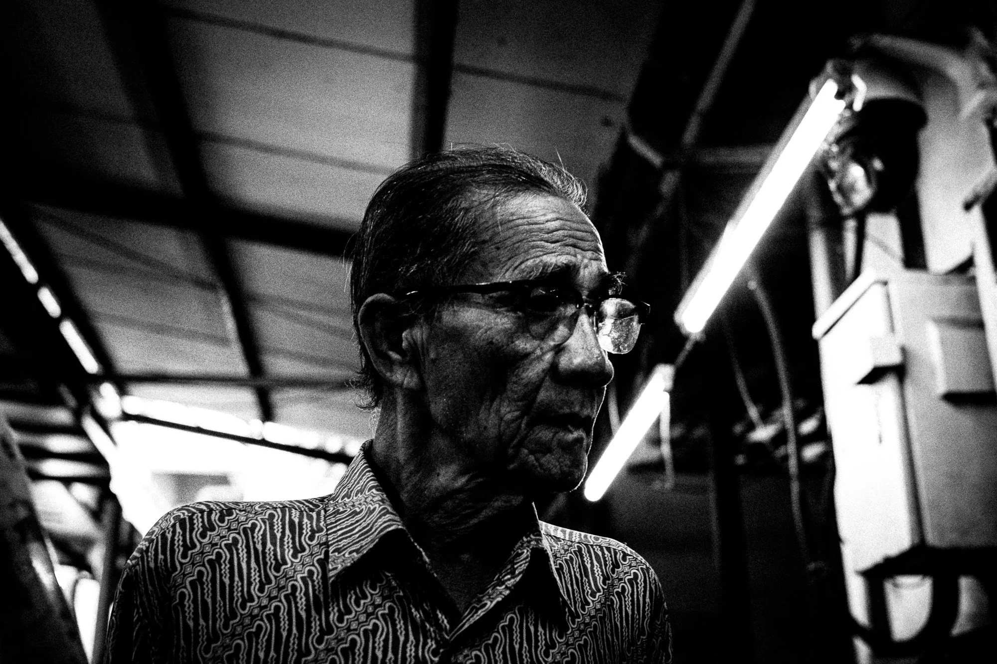
Maybe that's the actual finding, if there is one. Subtraction isn't a style. It's a choice you make per frame, and some frames are better for refusing it.
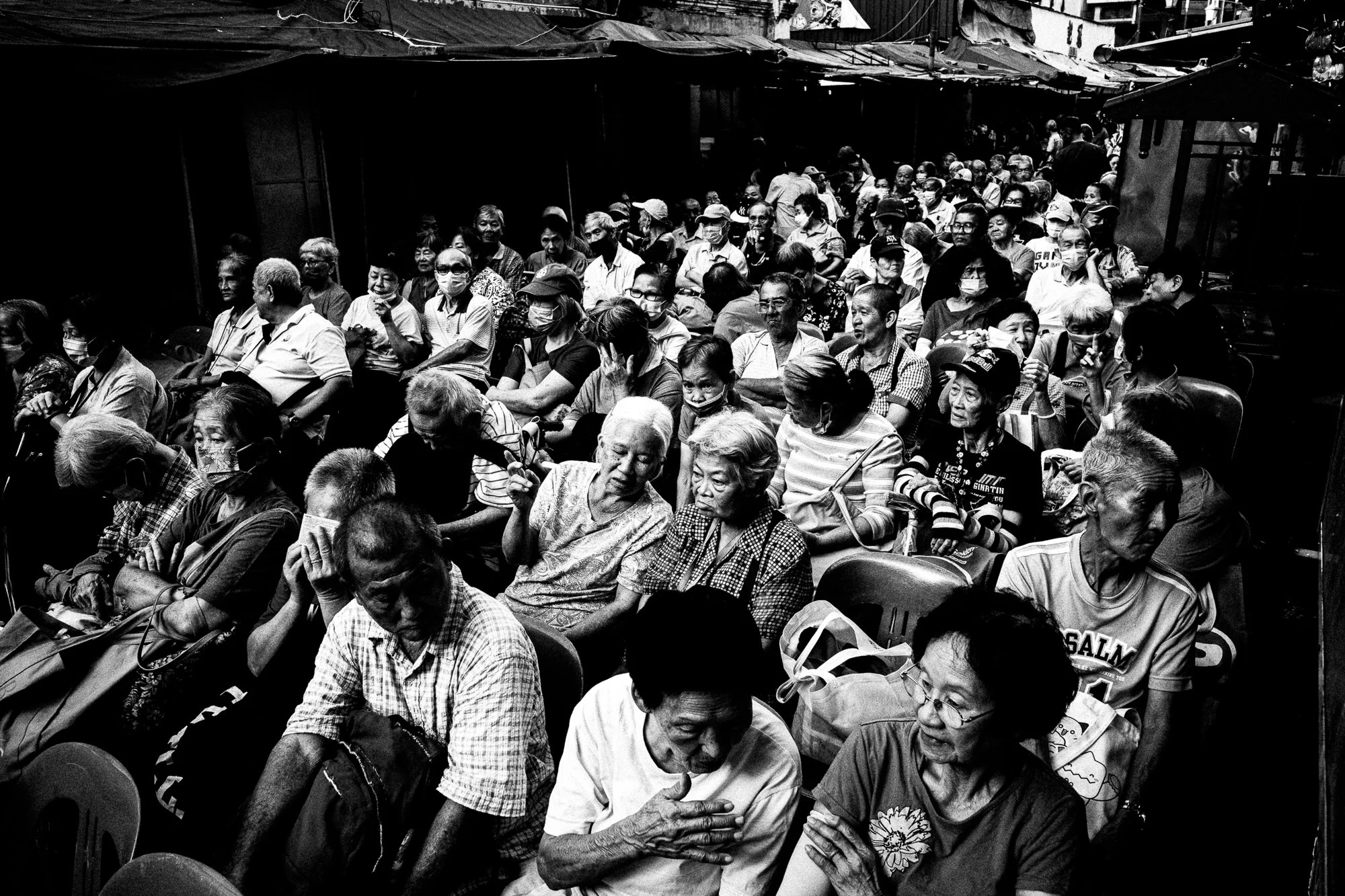
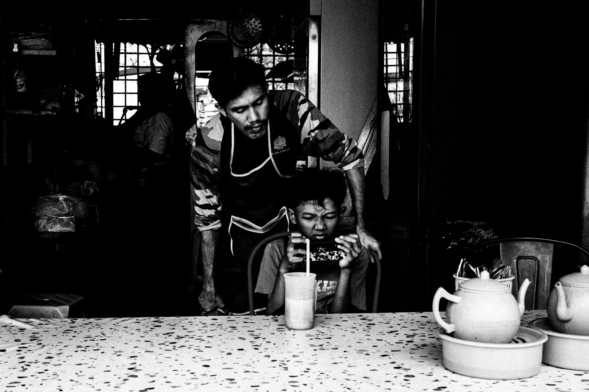
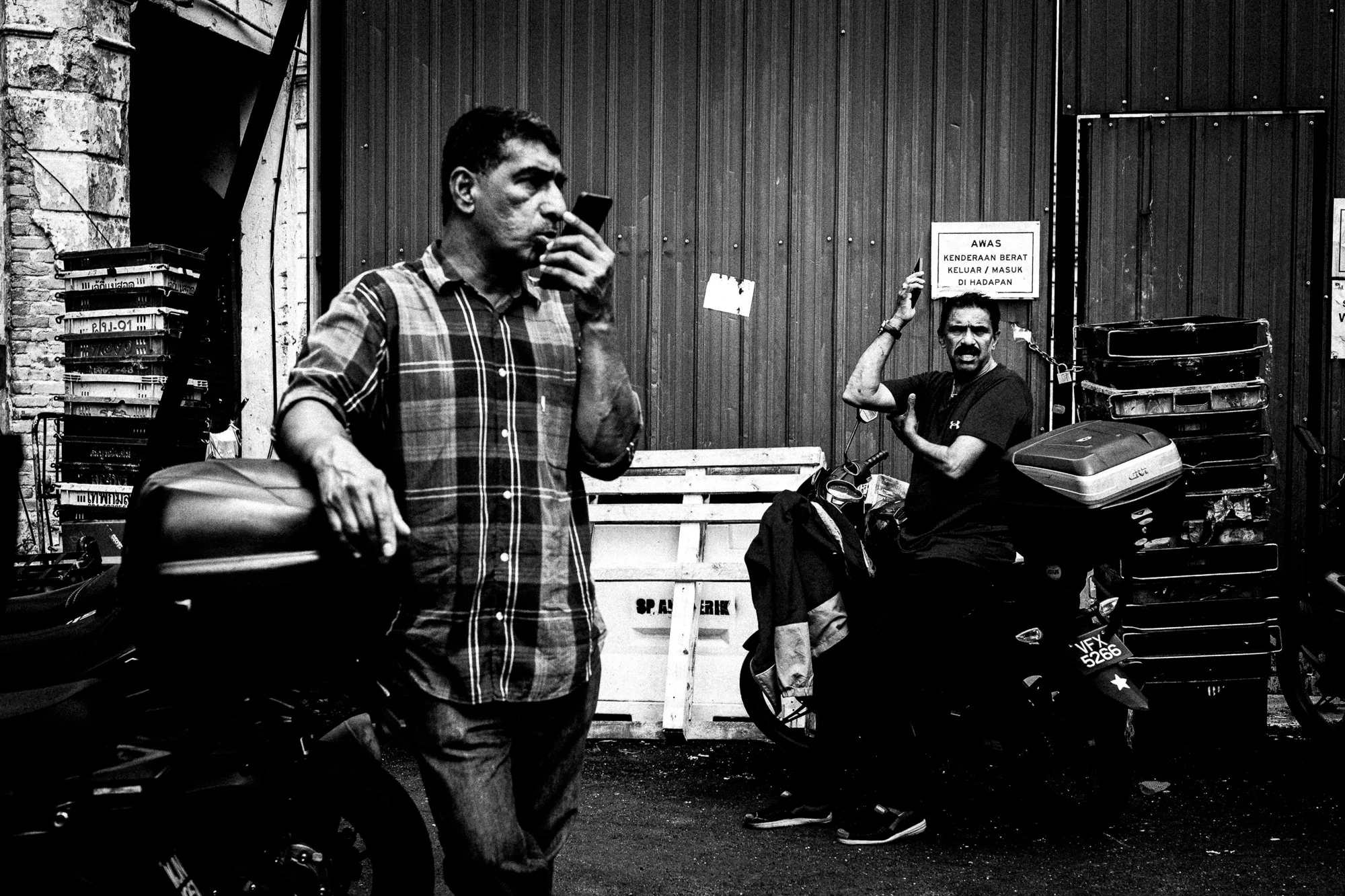
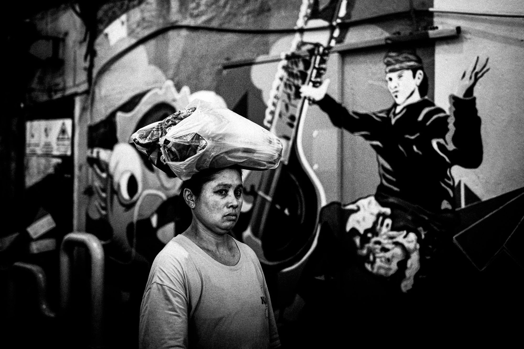
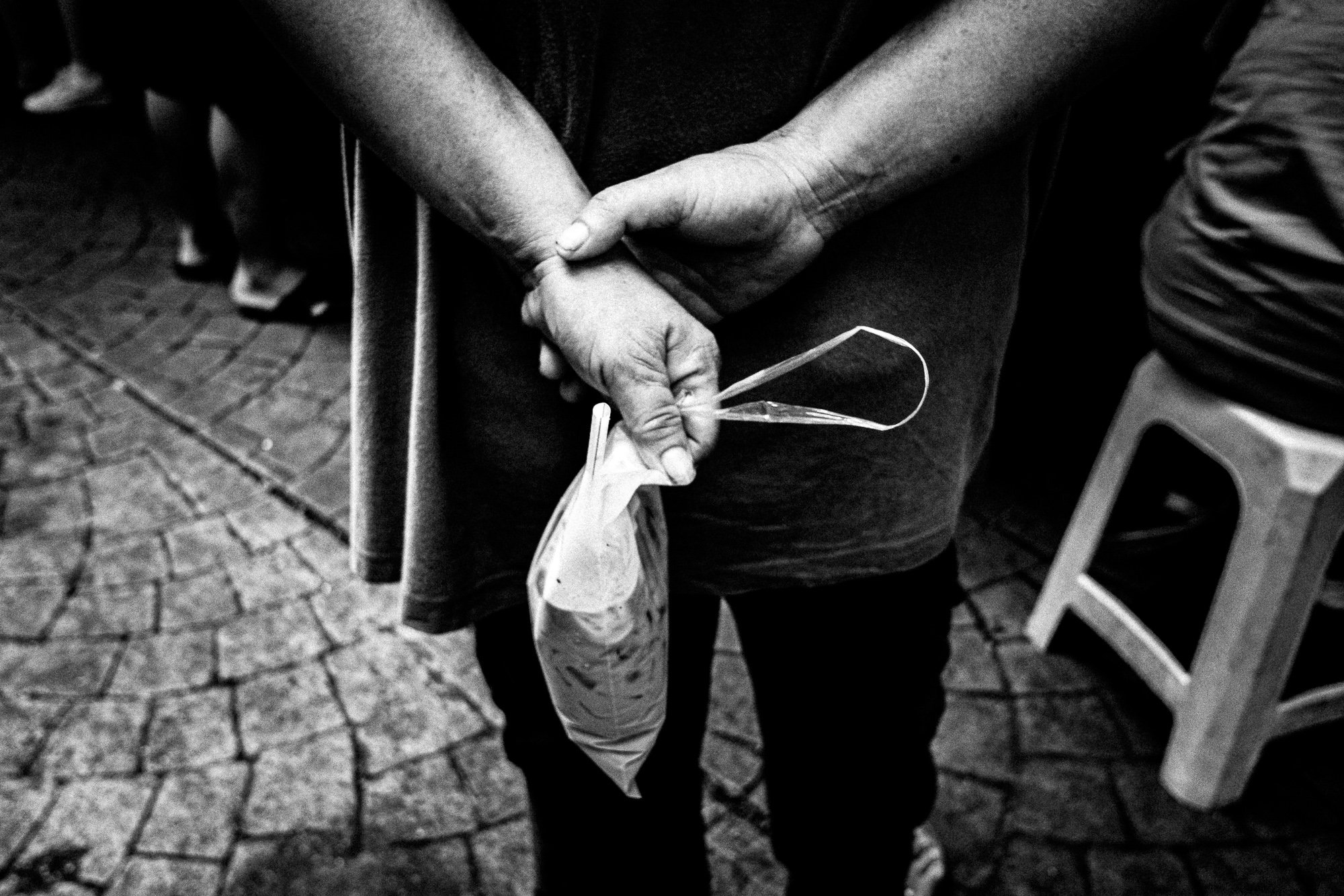
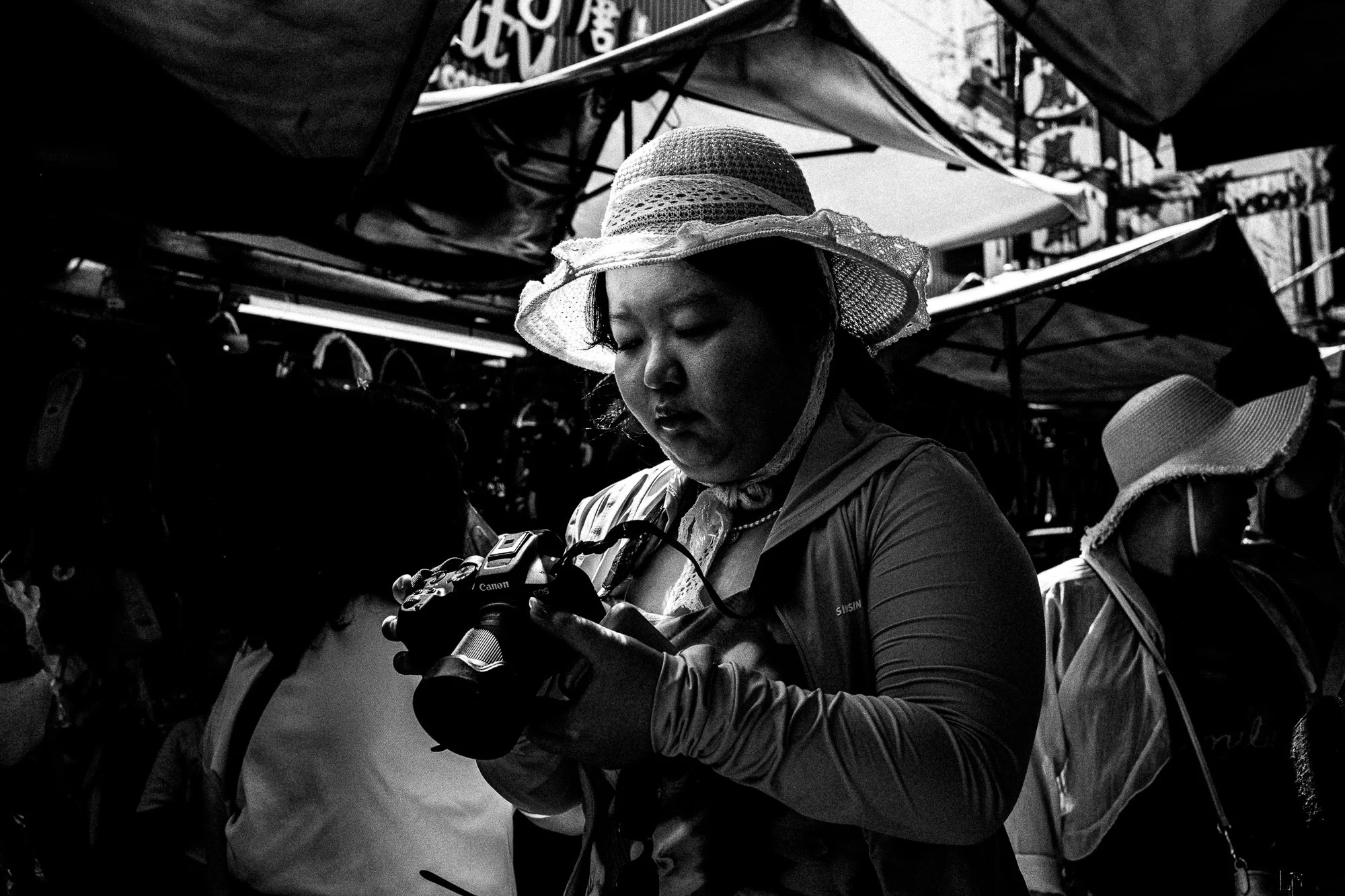
Here are the selections. Mostly cut down to less than they started with.
Cheers.
All photos taken with the Nikon ZF